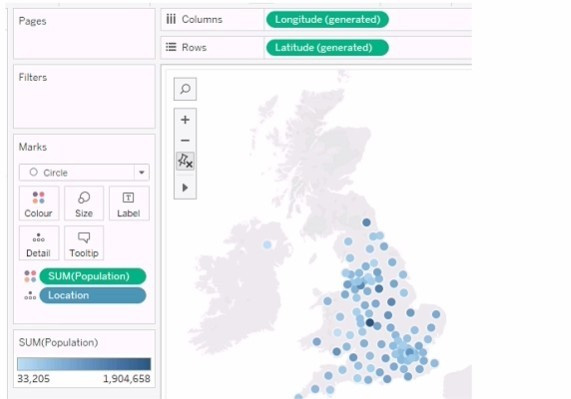
You need the map to appear as shown in the following visualization.
What should you do?
A. Change the mark type to Density
B. Drag Location to Size on the Marks card
C. Change the mark type to Map
D. Drag Population to Size on the Marks card
E. Change the opacity to 75%
Correct Answer: A
Explanation: The question presents a scenario where a geographic map visualization in Tableau needs to be transformed from a series of discrete circles representing data points to a density map visualization. The density map shows
concentrations of data points with a gradient of color, where denser areas are indicated by a darker color.
Here's the explanation for each option:
A. Change the mark type to Density: This is the correct answer because changing the mark type to 'Density' in Tableau creates a density map, which displays the concentration of data points with a color gradient. This is exactly what is needed to achieve the visual effect shown in the second image, where regions with a higher concentration of data points are represented by darker shades. B. Drag Location to Size on the Marks card: This option would adjust the size of the marks based on the number of locations, which is not relevant to creating a density map. It would result in varying sizes of circles, not a continuous gradient. C. Change the mark type to Map: The visualization is already using a map. This option would not change the visualization to the desired density map. D. Drag Population to Size on the Marks card: This would change the size of the circles based on the population values, making some circles larger and others smaller. This is not how a density map is created, which uses color intensity rather than size to show concentration. E. Change the opacity to 75%: Changing the opacity would affect the transparency of the marks on the map but would not transform the visualization into a density map. To achieve the visualization shown in the second image, the mark type must be changed to 'Density,' which will produce a heat map-like effect where the color intensity represents the concentration of data points. Therefore, the correct answer is A. Change the mark type to Density.
To create a density map from a scatter plot of data points, you would change the mark type to Density. This mark type allows you to visualize the concentration of data points in an area, which can be useful for identifying clusters or patterns in geospatial data.
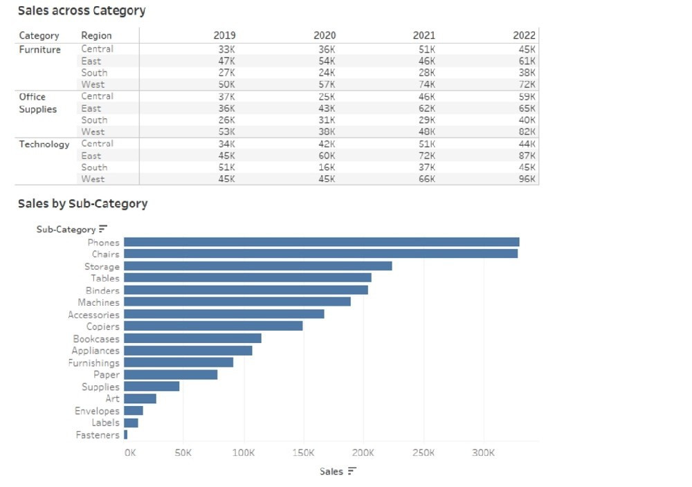
Question 62:
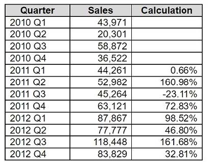
You have the following dataset.
Which formula calculates the percent difference in sales relative to the same quarter the previous year as shown in the Calculation field?
Explanation: The formula in option B calculates the percent difference in sales relative to the same quarter the previous year. It subtracts the sales of the same quarter from the previous year from the current year's sales, and then divides this by the previous year's sales. This gives a percentage change, which aligns with what is shown in the Calculation field of your dataset. The LOOKUP function returns the value of a specified offset from the current row in the partition. In this case, the offset is -4, which means the value of the same measure four rows above the current row. This corresponds to the same quarter of the previous year, assuming the data is sorted by quarter. References: LOOKUP Function - Tableau Table Calculations - Tableau Tableau Certified Data Analyst Study Guide
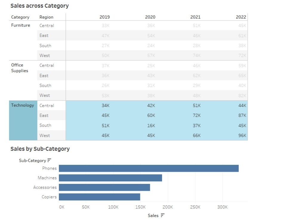
Question 63:
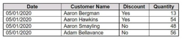
You have the following dataset:
You want to create a parameter to dynamically filter the data to produce the following results.
Which two types of parameters can you use to produce the results? Choose two.
A. Float
B. Boolean
C. Date
D. Datetime
E. String
F. Integer
Correct Answer: EF
Explanation: In the context of filtering data in Tableau, both string and integer parameters can be used to dynamically filter data. A string parameter can be used to filter text-based values, while an integer parameter is suitable for numerical values. In the provided dataset and result URLs, it appears that a unique identifier or key (which could be a string or integer) is being used to filter specific data entries. References: The information is based on the following sources: An Introduction to Parameters in Tableau Create Parameters - Tableau
Question 64:
You are creating a new dashboard.
You need to add a button to the dashboard that allows users to export the dashboard as an image.
Which type of object should you use?
A. Image
B. Ask Data
C. Extension
D. Download
E. Navigation
Correct Answer: C
Explanation: Extensions in Tableau are web-based programs that can interact with dashboards. To add a button that allows users to export the dashboard as an image, you would use an Extension object. This could be a custom extension designed to trigger the download of the dashboard view as an image.
Question 65:
You have a workbook that connects to a database. The database requires authentication.
You plan to publish the workbook and schedule a daily refresh of the data.
Which two conditions must be met to schedule the refresh? Choose two.
A. The credentials must be embedded.
B. The data source must be stored as a hyper file.
C. The data source must use a live connection.
D. The data must be extracted.
Correct Answer: AD
To schedule a refresh of the data, you need to ensure that Tableau Server or Tableau Online can access the database without prompting for credentials. This can be done by embedding the credentials in the workbook or the published data source. You also need to extract the data from the database and publish it as a separate data source or as part of the workbook. A live connection would not allow you to refresh the data on a schedule, as it would always query the database directly. A hyper file is a format for storing extracted data, but it is not a requirement for scheduling a refresh. References: Tableau Certified Data Analyst Exam Prep Guide, page 10, section "Publishing and Scheduling Data Refreshes" Tableau Help: Embedding Database Credentials Tableau Help: Extract Your Data
Question 66:
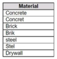
You connect to a database server by using Tableau Prep. The database server has a data role named Role1.
You have the following field in the data.
You need to apply the Role1 data role to the Material field.
Which two actions should you perform? Choose two.
A. From the More actions menu of Materials, select Valid in the Show values section.
B. For the data type of the Material field, select Custom, and then select Role1.
C. From the More actions menu of Materials, select Group Values, and then select Spelling.
D. From the More actions menu of Materials, filter the selected values.
Correct Answer: BC
To apply a custom data role to a field, you need to select the data type of the field and then choose the data role from the list of available roles. This will validate the values in the field against the data role and mark any invalid values with a red exclamation mark. To fix the invalid values, you can use the Group Values option and select the Spelling algorithm, which will group values that are close in spelling and replace them with the most frequent value in the group. This will help you standardize the values in the Material field and match them with the Role1 data role. References: The information is based on the following sources: Use Data Roles to Validate your Data - Tableau New in Tableau Prep: Automatically identify data quality issues with Data Roles
Question 67:
You are creating an annual report in Microsoft Word. In Tableau Desktop, you build a chart in a worksheet.
You want to create an image of the chart that you can add to the annual report.
What are two ways to create the image? Choose two.
A. From the Worksheet menu, use the Export option.
B. From the Worksheet menu, use the Copy option.
C. From the File menu, use the Export As Version option.
D. From the Dashboard menu, use the Export Image option.
E. From the Dashboard menu, use the Copy Image option.
Correct Answer: AB
Explanation: To create an image of the chart that you can add to the annual report, you can use either the Export option or the Copy option from the Worksheet menu. The Export option will allow you to save the image as a file in a specified
location, name, and format. The Copy option will allow you to copy the image to the clipboard and paste it into another application, such as Microsoft Word. Both options will let you choose which elements to include in the image, such as title,
caption, legend, etc. References:
Export Views from Tableau Desktop to Another Application Copy and Paste Views from Tableau Desktop to Another Application
Question 68:
You want to create the following dashboard.
The dashboard will contain two sheets that will connect to the same data source. The top sheet will be configured to filter the bottom sheet. When you click a category on the top sheet, the sheets must resize as shown in the following exhibit.
How should you lay out the objects on the dashboard?
A. Drag a horizontal container to the dashboard and add both sheets to the container. Set the Fit to Standard.
B. Add both sheets to the dashboard. Set Fit to Fix width.
C. Drag a blank object to the dashboard and add both sheets to the dashboard. Set Fit to Entire view.
D. Drag a vertical container to the dashboard and add both sheets to the container. Set Fit to Entire view.
Correct Answer: D
Explanation: To create the dashboard as shown in the image, you need to use a vertical layout container that will adjust the height of the sheets according to the window size. You also need to set the Fit to Entire view option for both sheets so that they will resize proportionally when you click a category on the top sheet. This way, you can achieve the desired effect of having the bottom sheet expand to fill the space left by the top sheet when it filters out some categories. References: Size and Lay Out Your Dashboard - Tableau Create a Dashboard - Tableau Format Dashboard Layout in Tableau - GeeksforGeeks
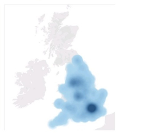
Question 69:
You have the following Map.
You need the map to appear as shown in the following visualization.
What should you do?
A. Drag Location to Size on the Marks card.
B. Change the opacity to 75%.
C. Drag Population to Size on the Marks card.
D. Change the mark type to Density.
E. Change the mark type to Map.
Correct Answer: D
To create a map visualization that shows the concentration of data points in different locations, you need to change the mark type to Density. This will create a heatmap that uses color and size to indicate the density of the data points. You can also adjust the intensity and transparency of the density marks to suit your needs. References: The information is based on the following sources: Create Heatmaps that Show Trends or Density in Tableau Build a Simple Map - Tableau
Question 70:
In a dataset, you have a string field named Name that contains unnecessary semicolons.
Which function should you use to remove the semicolons from the Name field?
A. TRIM
B. CONTAINS
C. REPLACE
D. SPLIT
Correct Answer: C
Explanation: The REPLACE function is used to replace all occurrences of a substring within a string with another substring. In this case, it can be used to remove the semicolons from the Name field by replacing them with an empty string. For example, REPLACE ("John;Doe", ";", "") = "JohnDoe". References: The information is based on the following sources: String Functions - Tableau Remove special characters and add a semi colon in a word - Tableau
Nowadays, the certification exams become more and more important and required by more and more enterprises when applying for a job. But how to prepare for the exam effectively? How to prepare for the exam in a short time with less efforts? How to get a ideal result and how to find the most reliable resources? Here on Vcedump.com, you will find all the answers. Vcedump.com provide not only Tableau exam questions, answers and explanations but also complete assistance on your exam preparation and certification application. If you are confused on your TDA-C01 exam preparations and Tableau certification application, do not hesitate to visit our Vcedump.com to find your solutions here.