
SPLK-4001 Real Exam Questions

Splunk O11y Cloud Certified Metrics User

54 questions available · Page 1 of 6

Updated Exam DumpsVerified AnswersPass Guarantee

Get Complete Exam Dumps
Question 1 Multiple choice

An SRE creates an event feed chart in a dashboard that shows a list of events that meet criteria they specify.
Which of the following should they include?
(select all that apply)

  1. A

    Custom events that have been sent in from an external source.

  2. B

    Events created when a detector clears an alert.

  3. C

    Random alerts from active detectors.

  4. D

    Events created when a detector triggers an alert.

Show answer and explanation

Correct answers: A, B, D

Explanation

According to the web search results, an event feed chart is a type of chart that shows a list of events that meet criteria you specify. An event feed chart can display one or more event types depending on how you specify the criteria. The event types that you can include in an event feed chart are: Custom events that have been sent in from an external source: These are events that you have created or received from a third-party service or tool, such as AWS CloudWatch, GitHub, Jenkins, or PagerDuty. You can send custom events to Splunk Observability Cloud using the API or the Event Ingest Service. Events created when a detector triggers or clears an alert: These are events that are automatically generated by Splunk Observability Cloud when a detector evaluates a metric or dimension and finds that it meets the alert condition or returns to normal. You can create detectors to monitor and alert on various metrics and dimensions using the UI or the API.
Therefore, option A, B, and D are correct.
Question 2 Single choice

What is the limit on the number of properties that an MTS can have?

  1. A

    64

  2. B

    36

  3. C

    No limit

  4. D

    50

Show answer and explanation

Correct answer: A

Explanation

The correct answer is A. 64.
According to the web search results, the limit on the number of properties that an MTS can have is 64. A property is a key-value pair that you can assign to a dimension of an existing MTS to add more context to the metrics. For example, you can add the property use: QA to the host dimension of your metrics to indicate that the host is used for QA Properties are different from dimensions, which are key-value pairs that are sent along with the metrics at the time of ingest. Dimensions, along with the metric name, uniquely identify an MTS. The limit on the number of dimensions per MTS is 362 To learn more about how to use properties and dimensions in Splunk Observability Cloud, you can refer to this documentation.
https://docs.splunk.com/Observability/metrics-and-metadata/metrics-dimensions-mts.html#Custom-properties
https://docs.splunk.com/Observability/metrics-and-metadata/metrics-dimensions-mts.html

Question 3 Single choice

Which of the following aggregate analytic functions will allow a user to see the highest or lowest n values of a metric?

  1. A

    Maximum / Minimum

  2. B

    Best/Worst

  3. C

    Exclude / Include

  4. D

    Top / Bottom

Show answer and explanation

Correct answer: D

Explanation

The correct answer is D. Top / Bottom. Top and bottom are aggregate analytic functions that allow a user to see the highest or lowest n values of a metric. They can be used to select a subset of the time series in the plot by count or by percent. For example, top (5) will show the five time series with the highest values in each time period, while bottom (10%) will show the 10% of time series with the lowest values in each time period
To learn more about how to use top and bottom functions in Splunk Observability Cloud, you can refer to this documentation.

Question 4 Single choice

For which types of charts can individual plot visualization be set?

  1. A

    Line, Bar, Column

  2. B

    Bar, Area, Column

  3. C

    Line, Area, Column

  4. D

    Histogram, Line, Column

Show answer and explanation

Correct answer: C

Explanation

The correct answer is C. Line, Area, Column. For line, area, and column charts, you can set the individual plot visualization to change the appearance of each plot in the chart. For example, you can change the color, shape, size, or style of the lines, areas, or columns. You can also change the rollup function, data resolution, or y-axis scale for each plot
To set the individual plot visualization for line, area, and column charts, you need to select the chart from the Metric Finder, then click on Plot Chart Options and choose Individual Plot Visualization from the list of options. You can then customize each plot according to your preferences
To learn more about how to use individual plot visualization in Splunk Observability Cloud, you can refer to this documentation.
https://docs.splunk.com/Observability/gdi/metrics/charts.html#Individual-plot-visualization
https://docs.splunk.com/Observability/gdi/metrics/charts.html#Set-individual-plot-
visualization

Question 5 Single choice

Which analytic function can be used to discover peak page visits for a site over the last day?

  1. A

    Maximum: Transformation (24h)

  2. B

    Maximum: Aggregation (Id)

  3. C

    Lag: (24h)

  4. D

    Count: (Id)

Show answer and explanation

Correct answer: A

Explanation

According to the Splunk Observability Cloud documentation1, the maximum function is an analytic function that returns the highest value of a metric or a dimension over a specified time interval. The maximum function can be used as a transformation or an aggregation. A transformation applies the function to each metric time series (MTS) individually, while an aggregation applies the function to all MTS and returns a single value. For example, to discover the peak page visits for a site over the last day, you can use the following SignalFlow code:
maximum(24h, counters("page.visits"))
This will return the highest value of the page.visits counter metric for each MTS over the last 24 hours. You can then use a chart to visualize the results and identify the peak page visits for each MTS.

Question 6 Single choice

Which of the following are supported rollup functions in Splunk Observability Cloud?

  1. A

    average, latest, lag, min, max, sum, rate

  2. B

    std_dev, mean, median, mode, min, max

  3. C

    sigma, epsilon, pi, omega, beta, tau

  4. D

    1min, 5min, 10min, 15min, 30min

Show answer and explanation

Correct answer: A

Explanation

According to the Splunk O11y Cloud Certified Metrics User Track document1, Observability Cloud has the following rollup functions: Sum: (default for counter metrics): Returns the sum of all data points in the MTS reporting interval. Average (default for gauge metrics): Returns the average value of all data points in the MTS reporting interval. Min: Returns the minimum data point value seen in the MTS reporting interval. Max: Returns the maximum data point value seen in the MTS reporting interval. Latest: Returns the most recent data point value seen in the MTS reporting interval.
Lag: Returns the difference between the most recent and the previous data point values seen in the MTS reporting interval. Rate: Returns the rate of change of data points in the MTS reporting interval. Therefore, option A is correct.

Question 7 Single choice

A customer deals with a holiday rush of traffic during November each year, but does not want to be flooded with alerts when this happens. The increase in traffic is expected and consistent each year.

Which detector condition should be used when creating a detector for this data?

  1. A

    Outlier Detection

  2. B

    Static Threshold

  3. C

    Calendar Window

  4. D

    Historical Anomaly

Show answer and explanation

Correct answer: D

Explanation

historical anomaly is a detector condition that allows you to trigger an alert when a signal deviates from its historical pattern. Historical anomaly uses machine learning to learn the normal behavior of a signal based on its past data, and then compares the current value of the signal with the expected value based on the learned pattern. You can use historical anomaly to detect unusual changes in a signal that are not explained by seasonality, trends, or cycles.
Historical anomaly is suitable for creating a detector for the customer's data, because it can account for the expected and consistent increase in traffic during November each year. Historical anomaly can learn that the traffic pattern has a seasonal component that peaks in November, and then adjust the expected value of the traffic accordingly. This way, historical anomaly can avoid triggering alerts when the traffic increases in November, as this is not an anomaly, but rather a normal variation. However, historical anomaly can still trigger alerts when the traffic deviates from the historical pattern in other ways, such as if it drops significantly or spikes unexpectedly.

Question 8 Single choice

A customer is experiencing an issue where their detector is not sending email notifications but is generating alerts within the Splunk Observability UI.

Which of the below is the root cause?

  1. A

    The detector has an incorrect alert rule.

  2. B

    The detector has an incorrect signal,

  3. C

    The detector is disabled.

  4. D

    The detector has a muting rule.

Show answer and explanation

Correct answer: D

Explanation

The most likely root cause of the issue is D. The detector has a muting rule. A muting rule is a way to temporarily stop a detector from sending notifications for certain alerts, without disabling the detector or changing its alert conditions. A muting rule can be useful when you want to avoid alert noise during planned maintenance, testing, or other situations where you expect the metrics to deviate from normal When a detector has a muting rule, it will still generate alerts within the Splunk Observability UI, but it will not send email notifications or any other types of notifications that you have configured for the detector.
You can see if a detector has a muting rule by looking at the Muting Rules tab on the detector page. You can also create, edit, or delete muting rules from there
To learn more about how to use muting rules in Splunk Observability Cloud, you can refer to this documentation.

Question 9 Single choice

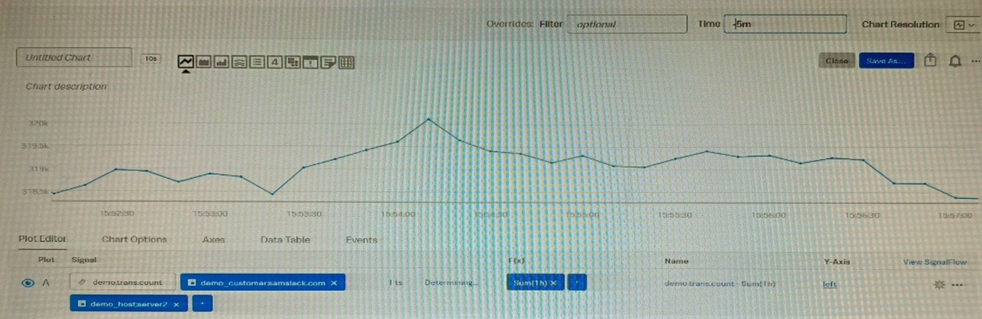
Given that the metric demo. trans.
count is being sent at a 10 second native resolution, which of the following is an accurate description of the data markers displayed in the chart below?

  1. A

    Each data marker represents the average hourly rate of API calls.

  2. B

    Each data marker represents the 10 second delta between counter values.

  3. C

    Each data marker represents the average of the sum of datapoints over the last minute, averaged over the hour.

  4. D

    Each data marker represents the sum of API calls in the hour leading up to the data marker.

Show answer and explanation

Correct answer: D

Explanation

The correct answer is D. Each data marker represents the sum of API calls in the hour leading up to the data marker.
The metric demo.trans.count is a cumulative counter metric, which means that it represents the total number of API calls since the start of the measurement. A cumulative counter metric can be used to measure the rate of change or the sum of events over a time period1 The chart below shows the metric demo.trans.count with a one-hour rollup and a line chart type. A rollup is a way to aggregate data points over a specified time interval, such as one hour, to reduce the number of data points displayed on a chart.
A line chart type connects the data points with a line to show the trend of the metric over time Each data marker on the chart represents the sum of API calls in the hour leading up to the data marker. This is because the rollup function for cumulative counter metrics is sum by default, which means that it adds up all the data points in each time interval. For example, the data marker at 10:00 AM shows the sum of API calls from 9:00 AM to 10:00 AM To learn more about how to use metrics and charts in Splunk Observability

Cloud, you can refer to these documentations.
https://docs.splunk.com/Observability/gdi/metrics/metrics.html#Metric-types
https://docs.splunk.com/Observability/gdi/metrics/charts.html#Data-resolution-and-rollups-
in-charts
https://docs.splunk.com/Observability/gdi/metrics/charts.html#Rollup-functions-
for-metric-types

Question 10 Single choice

For a high-resolution metric, what is the highest possible native resolution of the metric?

  1. A

    2 seconds

  2. B

    15 seconds

  3. C

    1 second

  4. D

    5 seconds

Show answer and explanation

Correct answer: C

Explanation

The correct answer is C. 1 second.

According to the Splunk Test Blueprint - O11y Cloud Metrics User document1, one of the metrics concepts that is covered in the exam is data resolution and rollups. Data resolution refers to the granularity of the metric data points, and rollups are the process of aggregating data points over time to reduce the amount of data stored. The Splunk O11y Cloud Certified Metrics User Track document2 states that one of the recommended courses for preparing for the exam is Introduction to Splunk Infrastructure Monitoring, which covers the basics of metrics monitoring and visualization. In the Introduction to Splunk Infrastructure Monitoring course, there is a section on Data Resolution and Rollups, which explains that Splunk Observability Cloud collects high-resolution metrics at 1-second intervals by default, and then applies rollups to reduce the data volume over time. The document also provides a table that shows the different rollup intervals and retention periods for different resolutions. Therefore, based on these documents, we can conclude that for a high-resolution metric, the highest possible native resolution of the metric is 1 second.