
QSBA2024 Real Exam Questions

Qlik Sense Business Analyst Certification - 2024

50 questions available · Page 1 of 5

Updated Exam DumpsVerified AnswersPass Guarantee

Get Complete Exam Dumps
Question 1 Single choice

A business analyst is developing an app that contains a data model with fields: Country, City, Sales, ProductName, and ProductCategory. The global sales manager wants to add new visualizations to this app.

The business analyst must include the following:

1. Ability to dynamically change the number of countries and cities
2. Display a maximum of 10 countries
3. Display a maximum of 5 cities per country

Which steps should the business analyst take?

  1. A

    1. Create two variables: vCountry and vCity
    2. Add a slider for vCountry and vCity max limit range
    3. Apply the variable to each visualization

  2. B

    1. Add an input field for vCountry and vCity
    2. Set the dimension limitation to the required maximum values: 5 and 10
    3. Apply the variable to each visualization
    4. Add a bookmark Country and City

  3. C

    1. Add an input field for vCountry and vCity
    2. Set the dimension limitation to the required maximum values: 5 and 10
    3. Apply the variable to each visualization

  4. D

    1. Create two variables: vCountry and vCity
    2. Add a slider for vCountry and vCity
    3. Apply the variable to each visualization
    4. Set a sheet action that limits the data displayed

Show answer and explanation

Correct answer: A

Explanation

To meet the requirement of dynamically changing the number of countries and cities displayed in the visualizations, the business analyst should use variables to control the number of countries and cities shown. By creating two variables (vCountry and vCity), the analyst can use sliders to allow the user to adjust the maximum number of countries (up to 10) and cities (up to 5 per country) that are displayed.
These variables can then be applied to each visualization to control the displayed data.

Key Concepts:
Variables: Variables allow users to dynamically adjust values in Qlik Sense visualizations. In this case, sliders can be used to change the number of countries and cities displayed.
Slider Object: Adding a slider enables users to easily adjust the values of the variables vCountry and vCity in a user-friendly manner.

Why the Other Options Are Less Suitable:
B. Input field and dimension limitation: This option is unnecessarily complex and doesn't provide the same
dynamic control as using variables and sliders.
C. Input field without sliders: While input fields could work, sliders offer a more intuitive way for users to
adjust the values dynamically.
D. Sheet action: Setting a sheet action to limit the data displayed is less flexible and doesn't provide the
same dynamic interaction as using variables and sliders.

References for Qlik Sense Business Analyst: Dynamic Visualizations with Variables: Qlik Sense recommends using variables and interactive objects like sliders to give users control over dynamic data visualizations.

Thus, the most effective solution is to create variables and use sliders to dynamically control the number of countries and cities, making the correct answer. A
Question 2 Single choice

A clothing manufacturer has operations throughout Europe and needs to manage access to the data.

There is data for the following countries under the field SACOUNTRY -> France, Spain, United Kingdom
and Germany. The application has been designed with Section Access to manage the data displayed.

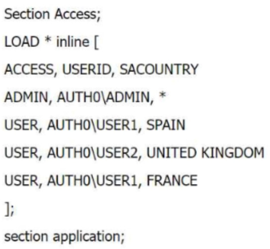
What is the expected outcome of this Section Access table?

  1. A

    USER1 sees data for France and Spain, USER2 sees data for the UK. ADMIN sees data for France, Spain, Germany and United Kingdom

  2. B

    USER1 does not see data for France and Spain. USER2 does not see data for the United Kingdom.
    ADMIN sees data for all countries.

  3. C

    USER1 does not see data for France and Spain, USER2 does not see data for United Kingdom.
    ADMIN can not open the application

  4. D

    USER1 sees data for France and Spain, USER2 sees data for the UK. ADMIN sees data for France, Spain and United Kingdom

Show answer and explanation

Correct answer: A

Explanation

In this Section Access script, the roles and access to data for different users are defined based on the SACOUNTRY field. Here's how the data access will work:

ADMIN: The ADMIN user has access to all data because the * in the SACOUNTRY field allows full access to all countries in the dataset.
USER1: This user has access to Spain and France because the SACOUNTRY field specifies these countries for USER1.
USER2: This user has access to United Kingdom because the SACOUNTRY field specifies only the UK for USER2.

Key Concepts:
Section Access: This feature in Qlik Sense controls which data users can see based on their login credentials. The access rights are controlled through fields like ACCESS USERID , , and SACOUNTRY in this case.

Why the Other Options Are Less Suitable: B and C: These suggest that users won't see data they have access to, which contradicts the defined Section Access script.
D: This incorrectly assumes that ADMIN cannot see Germany, which is not defined in the script.

References for Qlik Sense Business Analyst: Section Access Best Practices: In Qlik Sense, Section Access tables define the data that users can see, and the use of * for the ADMIN role ensures access to all data.
Thus, is the correct answer because it matches the expected data access behavior based on the script, making A it the verified answer.

Question 3 Single choice

The human resources department needs to see a distribution of salaries broken down by department with standard deviation indicators.

Which visualization should the developer use?

  1. A

    Distribution plot

  2. B

    Box plot

  3. C

    Histogram

  4. D

    Scatter plot

Show answer and explanation

Correct answer: B

Explanation

A box plot is the best visualization for displaying the distribution of salaries broken down by department with standard deviation indicators. Box plots show the spread of data, including key measures like quartiles, median, and outliers, which are useful for analyzing salary distributions. They also naturally incorporate standard deviation indicators through the spread of data.

Key Concepts:
Box Plot: This type of chart is designed for analyzing the distribution of data across different categories (in this case, departments). It shows the spread and variability of data, which can include standard deviations.

Why the Other Options Are Less Suitable:
A. Distribution plot: While a distribution plot can show spread, it's not as effective for showing standard
deviation and is less suited for categorical breakdowns.
C. Histogram: A histogram shows the distribution of a single variable, but it doesn't provide the same
detailed breakdown as a box plot.
D. Scatter plot: Scatter plots are used for showing relationships between two variables and are not suitable
for showing standard deviation across departments.

References for Qlik Sense Business Analyst: Box Plot for Distribution Analysis: Box plots are ideal for visualizing data distribution and variability across categories, making them the preferred choice for analyzing salary distribution by department.
Thus, the box plot is the best choice for visualizing salary distribution with standard deviation indicators, making the verified answer. B

Question 4 Single choice

A marketing team needs to display sales for a limited number of products by providing a bar chart that the user can control. The visualization has several requirements:

1. Starts with the top five products
2. Allows the user to change the number of products displayed
3. Allows the user to scroll through all products on a mini chart

The business analyst creates a bar chat and a variable.

Which steps should the business analyst complete next?

  1. A

    1. Add the slider object and use the variable to set its value
    2. Set the number of bars to custom and use the variable to set its value

  2. B

    1. Use the variable to fix the limitation
    2. Add an input box to enable the user to enter the required value

  3. C

    1. Use the variable to fix the limitation
    2. Add a slider object and use the variable to set its value

  4. D

    1. Add the slider object and use the variable to set its value
    2. Use the properties to set the number of bars to custom

Show answer and explanation

Correct answer: A

Explanation

To meet the requirement of controlling the number of products displayed in the bar chart, the business analyst should use a slider object tied to a variable. The variable will store the number of products the user wants to display. In the Appearance section of the bar chart's properties, the analyst can set the number of bars to a custom value using the variable, ensuring that the user can dynamically change the number of displayed products.

Key Concepts:
Slider Object: This provides a user-friendly way for users to adjust the number of products displayed in the bar chart.
Custom Bar Limitation: By setting the number of bars displayed to a custom value controlled by the variable, the business analyst ensures that the user can dynamically adjust how many products are shown.

Why the Other Options Are Less Suitable:
B. Use the variable to fix the limitation and add an input box: While this could work, sliders provide a better,
more intuitive user experience than input boxes for adjusting values dynamically.
C. Use the variable to fix the limitation and add a slider: This is almost correct, but it misses the step of
setting the number of bars to a custom value using the variable.
D. Add the slider object and set its value, but without custom bar settings: While adding a slider is correct,
not setting the number of bars to custom using the variable means the user wouldn't be able to dynamically control the number of displayed products.

References for Qlik Sense Business Analyst: Dynamic Control with Variables and Sliders: Qlik Sense best practices recommend using sliders and variables to give users control over visualizations, particularly when it comes to dynamically limiting data displayed.

Thus, adding the slider object and setting the number of bars to a custom value controlled by the variable is the best solution, making the verified answer. A

Question 5 Single choice

A company has recently implemented Qlik Sense. A user is looking to use natural language questions to help create content.

Which feature can achieve this goal?

  1. A

    Advanced Authoring

  2. B

    Story and Bookmarks

  3. C

    Insights Advisor Chat

  4. D

    Associative Engine

Show answer and explanation

Correct answer: C

Explanation

In Qlik Sense, the Insights Advisor Chat is the feature that allows users to interact with the app through natural language questions . This tool leverages Qlik's advanced AI and machine learning capabilities to interpret natural language queries and generate relevant insights, visualizations, or suggestions for analysis.

A. Advanced AuthoringAdvanced Authoring is a set of tools in Qlik Sense designed for creating detailed
visualizations and reports, but it does not include natural language interaction capabilities. It is focused more on customization and precise design rather than conversational querying.
B. Story and BookmarksStorytelling and bookmarks in Qlik Sense are tools for narrative data presentations
and saving specific states of analysis. They do not provide the ability to ask natural language questions or automatically generate insights.
C. Insights Advisor ChatInsights Advisor Chatis the correct answer. This feature allows users to interact
with their data by typing natural language questions, which the system interprets to generate appropriate responses, including charts, KPIs, and other insights. It is designed to assist non-technical users by making data exploration more intuitive and accessible through natural language.
D. Associative EngineThe Associative Engine is the underlying technology that allows Qlik Sense to
handle large datasets and perform associative searches across them. While it is powerful for data exploration, it does not provide a direct interface for natural language querying like Insights Advisor Chat does.

References:
Insights Advisor Chatis a feature in Qlik Sense that empowers users to ask questions in natural language and get meaningful responses without needing to be data experts.
It is part of Qlik Sense's broader set of augmented intelligence tools that enhance the user experience by providing guided insights and helping users discover relationships in data through natural language queries.
This feature simplifies data exploration for business users who might not be familiar with complex data querying techniques.
Thus, the feature that allows users to use natural language questions in Qlik Sense is Insights Advisor Chat .

Question 6 Single choice

A business analyst needs to rapidly prototype an application design for a prospective customer. The only dataset provided by the customer contains 30 fields, but has over one billion rows. It will take too long to keep loading in its entirety while the analyst develops the data model.

Which action should the business analyst complete in the Data manager?

  1. A

    Split the dataset and create a normalized star schema of associated tables

  2. B

    Deselect text columns with unique data values to reduce the memory footprint

  3. C

    Use the Filter data option to reduce the number of rows

  4. D

    Truncate text fields longer than 256 characters to create preview fields

Show answer and explanation

Correct answer: C

Explanation

When working with large datasets, such as the one containing over a billion rows in this scenario, loading the entire dataset can be time-consuming, especially during the development phase. Qlik Sense provides aFilter data option in the Data Manager, which allows business analysts to work with a subset of the data during development. This is particularly useful for rapidly prototyping the application design.

Key Concepts:
Filter Data Option: This feature in Qlik Sense allows the analyst to load a smaller sample of the dataset for analysis and development purposes. By filtering out unnecessary rows, the business analyst can quickly build and prototype the application without waiting for the full dataset to load. Once the design is finalized, the full dataset can be reloaded.
Prototyping with Reduced Data: It's often more efficient to work with a smaller dataset during the design phase. This allows for faster iterations and design cycles, especially when working with large datasets.

Why the Other Options Are Less Suitable:
A. Split the dataset and create a normalized star schema of associated tables: This would involve complex
data modeling that is not necessarily related to the immediate need of reducing the size of the dataset for prototyping. While star schemas can optimize data models, it's not the quickest way to reduce the number of rows for initial testing.
B. Deselect text columns with unique data values to reduce the memory footprint: This may reduce the
memory usage but won't necessarily address the issue of reducing the number of rows. Also, the text columns might be important for the analysis and should not be removed without careful consideration.
D. Truncate text fields longer than 256 characters to create preview fields: Truncating text fields will not
significantly reduce the dataset size or the load time. It may also result in losing critical information, which is not ideal for prototyping.

References for Qlik Sense Business Analyst: Rapid Prototyping: Qlik Sense encourages rapid development of applications by allowing business analysts to work with subsets of the data. The Filter Data option is an important tool for managing large datasets efficiently.
Data Manager Tools: The Data Manager in Qlik Sense provides several tools for reducing the dataset size, and filtering is one of the key options for improving performance during development.
Using the Filter data option allows the business analyst to focus on a smaller subset of data, enabling quicker prototyping and iteration, which makes option the most effective solution. C

Question 7 Single choice

In the 'Sales By Product' bar chart, a customer wants to highlight a specific product bar that includes a dynamic label. The label will only be visible when conditions are met.

Which feature should the business analyst add to the bar chart?

  1. A

    A Color By Expression property under Appearance

  2. B

    A Dimension reference line add-on

  3. C

    An Alternative dimension with a calculation

  4. D

    A reference line add-on under Properties

Show answer and explanation

Correct answer: A

Explanation

To dynamically highlight a specific product bar in a bar chart based on conditions, the best approach is to use the Color By Expression feature under the Appearance settings in Qlik Sense. This feature allows you to apply conditional formatting to bars, changing their color dynamically based on expression logic.

A. A Color By Expression property under AppearanceThis is the correct answer. TheColor By Expression
property allows the business analyst to dynamically color bars in the chart based on specific conditions.
The expression can be set to highlight a specific product bar only when certain conditions are met, and the color can be customized to make it stand out.
B. A Dimension reference line add-onDimension reference lines are used to show thresholds or important
values along the axes, but they do not dynamically color the bars or add conditional labels to them. This would not achieve the desired effect.
C. An Alternative dimension with a calculationAlternative dimensions allow users to switch between
different dimensions in the same chart, but they do not provide dynamic highlighting or conditional visibility for labels.
D. A reference line add-on under PropertiesReference lines are used to mark specific values or thresholds
in a chart, but they do not interact with the dynamic coloring or visibility of labels on individual bars.

References:
Color By Expressionis a powerful feature in Qlik Sense that allows dynamic customization of chart colors based on expressions, making it ideal for highlighting specific data points or conditions.
This feature provides great flexibility in creating visually engaging and interactive charts that respond to changes in the underlying data or user selections.
Thus, the correct way to highlight a specific product bar with a dynamic label is to useColor By Expression under Appearance .

Question 8 Single choice

A company has sales data where every Customer ID can be assigned to one or more Sales Account ID.
Sales Accounts are assigned to one of eight Groups. The business analyst is creating an app with the following requirements:

1. Each Group should have a separate sheet
2. The Sales Account can only see its own customers
3. The Sales Account can navigate only to the sheet for the Group assigned

The business analyst has created a Section Access table, in which each Sales Account ID is assigned their CustomerlDs.

Which action should the business analyst take next?

  1. A

    Use the Sales Account ID as a filter on the show/hide condition on the relevant sheet

  2. B

    Use the Group as a filter on the show/hide condition on the relevant sheet

  3. C

    Use the Group field within the Section Access table, then apply it to the show/hide condition of the sheets

  4. D

    Use the OSUser()function within the show/hide condition of the sheets to set the required visibility

Show answer and explanation

Correct answer: C

Explanation

The most effective way to control sheet access based on group assignment is to use the Group field in the Section Access table and apply it to the show/hide condition of the sheets. Each Sales Account ID is already mapped to a Group, so the business analyst can use this Group field to dynamically control which sheets are visible based on the user's Group assignment. This ensures that each Sales Account only sees their respective Group's sheet.

Key Concepts:
Section Access with Groups: By incorporating the Group field into Section Access, the analyst can restrict sheet visibility based on group membership.
Show/Hide Condition: This feature in Qlik Sense allows certain sheets or objects to be displayed or hidden based on conditions, in this case, the user's group.

Why the Other Options Are Less Suitable:
A. Sales Account ID as a filter: The Sales Account ID is used for data filtering but is not the appropriate
condition for controlling sheet visibility.
B. Group as a filter on the sheet: While Group can be used as a condition, it must be managed through
Section Access to ensure proper visibility control.
D. OSUser() function: While OSUser() can capture the user's login information, using the Group field in
Section Access is more efficient for controlling access to specific sheets based on group assignments.

References for Qlik Sense Business Analyst: Show/Hide Sheets Based on Section Access: Qlik Sense supports the use of Section Access for controlling access to sheets based on user roles and group assignments.
Thus, is the most appropriate solution because it uses the Group field within Section Access to control sheet C visibility, making it the correct answer.

Question 9 Single choice

A business analyst is creating a new app with sales data. The visualizations must meet several requirements:

A Bar chart that shows sales by product group is used in multiple sheets

1. A KPI object that visualizes that the total amount of sales is used once
2. A Treemap that shows margin by product group is used one time inside a Container

Which visualization should be added to the master items library?

  1. A

    Container

  2. B

    KPI

  3. C

    Bar chart

  4. D

    Treemap

Show answer and explanation

Correct answer: C

Explanation

The Bar chart is used multiple times across various sheets, which makes it a good candidate to be added to the Master Items library . Master items are reusable components that can be added to multiple visualizations across different sheets without needing to recreate them. Since the bar chart will be reused multiple times, adding it to the Master Items ensures consistency and reusability.

Key Concepts:
Master Items: These are predefined dimensions, measures, or visualizations that can be reused across multiple sheets in an app, ensuring consistency and reducing development time.

Why the Other Options Are Less Suitable:
A. Container: The container is only used once in this scenario, so it doesn't need to be a master item.
B. KPI: The KPI is only used once, so it does not require master item status.
D. Treemap: The treemap is only used once in a container, so it doesn't need to be a master item.

References for Qlik Sense Business Analyst: Master Items for Reusability: Qlik Sense recommends adding frequently used charts or dimensions to the master items for easy reuse and consistency.
Thus, the bar chart is the best choice for adding to the master items, making the correct answer. C

Question 10 Single choice

Two customers in an organization want to use an app that contains a finance data set. With different analysis objectives, each customer will only use a subset of that data.

Which procedure should the business analyst follow?

  1. A

    Apply Section Access to manage the data for each customer

  2. B

    Create multiple visualizations using set analysis

  3. C

    Duplicate and rename the apps for each customer

  4. D

    Unpivot, then re-associate the data tables for each customer

Show answer and explanation

Correct answer: B

Explanation

In Qlik Sense, Set Analysis is one of the most powerful tools available to a Business Analyst for managing different subsets of data within the same app. Since both customers are working with the same finance dataset but have different objectives, creating multiple visualizations using set analysis allows the analyst to tailor the data views for each customer without duplicating the app or creating complex data models.

Key Concepts:
Set Analysis: This feature enables the creation of expressions that define subsets of data, allowing you to filter data within specific visualizations. This is ideal when multiple users need different insights from the same underlying dataset.
Flexibility: Using set analysis, you can specify conditions within individual visualizations so that each user can focus on their own segment of the data without impacting others.
Efficiency: This method avoids redundancy by ensuring you only need one app and one data model, instead of duplicating and maintaining multiple apps or applying complex logic such as Section Access.

Why the Other Options Are Less Suitable:
A. Apply Section Access: While Section Access is useful for managing security and limiting what users can
see in the entire dataset, it is primarily designed to restrict data access based on user roles. In this case, both users need access to the same dataset but will conduct different analyses. Section Access would be an overly restrictive and complex solution for this scenario.
C. Duplicate and rename the apps: This is inefficient because it leads to redundancy and makes
maintenance harder (e.g., any changes to the dataset or visualizations would need to be applied to both apps). It also increases the risk of inconsistencies across versions of the app.
D. Unpivot and re-associate the data tables: This option is not relevant to the problem, as unpivoting is
more appropriate for transforming datasets rather than tailoring views for different users within the same app. It does not address the need for customer-specific analysis objectives.

References for Qlik Sense Business Analyst: Set Analysis: In the Qlik Sense Business Analyst's toolkit, Set Analysis is covered as a method to manage diverse data subsets within single apps, providing the flexibility needed in multi-user environments without duplicating content.
Efficient Application Design: Best practices suggest maintaining a single app where possible to ensure consistency and ease of maintenance, which aligns with the approach of using Set Analysis.

By using Set Analysis, you provide both customers with tailored data views that are easily managed and updated within a single app. This is why option B is the most effective and verified solution.