70-778 Exam Details
-
Exam Code
:70-778 -
Exam Name
:Analyzing and Visualizing Data with Microsoft Power BI -
Certification
:Microsoft Certifications -
Vendor
:Microsoft -
Total Questions
:155 Q&As -
Last Updated
:Oct 16, 2021
Microsoft 70-778 Online Questions & Answers
-
Question 31:
Note: This question is a part of a series of questions that present the same scenario. Each question in the series contains a unique solution that might meet the stated goals. Some question sets might have more than one correct solution,
while others might not have a correct solution.
After you answer a question in this section, you will NOT be able to return to it. As a result, these questions will not appear in the review screen.
You have a Power BI model that contains two tables named Sales and Date. Sales contains four columns named TotalCost, DueDate, ShipDate, and OrderDate. Date contains two columns named Date and Time.
The tables have the following relationships:
Sales [DueDate] and Date [Date]
Sales [ShipDate] and Date [Date]
Sales [OrderDate] and Date [Date]
The active relationship is on Sales [DueDate].
You need to create measures to count the number of orders by [ShipDate] and orders by [OrderDate]. You must meet the goal without loading any additional data.
Solution: You create a calculated table. You create a measure that uses the new table.
Does this meet the goal?
A. Yes
B. No -
Question 32:
You have the following table named Location.
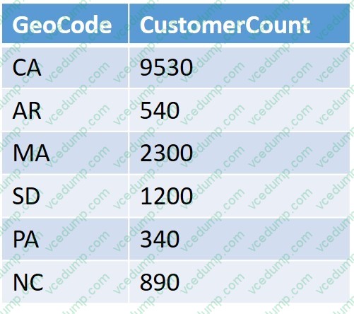
The GeoCode column represents the country where each customer is located.
You create a map visualization as shown in the exhibit. (Click the Exhibit tab.)
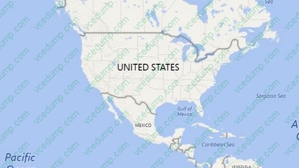
You need to ensure that the map displays the country locations. What should you do?
A. Replace the values in the GeoCode column with postal codes or zip codes.
B. Change the name of the GeoCode column to Country.
C. Change the name of the Location table to Country.
D. Change the Default Summarization of the GeoCode column.
E. Add a Geoportal column to the Location table.
F. Change the Data Type of the GeoCode column. -
Question 33:
You have a Power Bl Desktop project that has the model shown in the exhibit. (Click the Exhibit tab.)
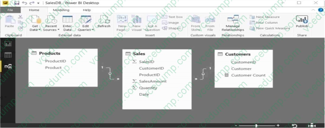
Customer Count is a measure that uses the countRows function to calculate the number of customers.
You create a table visualization that displays ProductID, Product, and Customer Count.
When you view the table, you discover that Customer Count always displays the total number of customers instead of the number of customers who purchased the product.
You need to ensure that the table visualization displays the number of customers who purchased each product.
What should you do?
A. Modify the Customer Count measure to use the count function.
B. Modify the table relationship between the Customers table and the Sales table to use a Cross filter direction of Both.
C. Modify the table relationship between the Products table and the Sales table to use a Cross filter direction of Both
D. Modify the Customer Count measure to use the countx function. -
Question 34:
You have a Power BI model for sales data. You create a measure to calculate the year-to- date sales.
You need to compare the year-to-date sales with the previous year for the same time period. Which DAX function should you use?
A. LASTDATE
B. TOTALYTFD
C. SAMEPERIOOLASTYEAR
D. PREVIOUSYEAR -
Question 35:
A data analyst publishes several Power BI visualizations to a blog. You discover that some of the visualizations contain data that is considered private by your company.
You need to prevent the visualizations from being published to the blog.
What should you do?
A. From the Power BI Admin portal, disable the Publish to web setting.
B. From the Power BI settings, delete the embedded codes.
C. From the Power BI Admin portal, disable the Share content with external users setting.
D. From the dashboard settings, modify the Share dashboard settings. -
Question 36:
You are creating a work schedule for a retail store.
You have the following data from a query named Schedule.
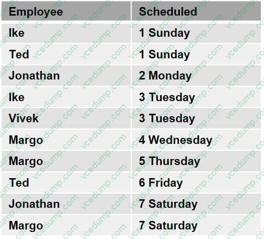
You need to visualize the data as shown in the following exhibit.
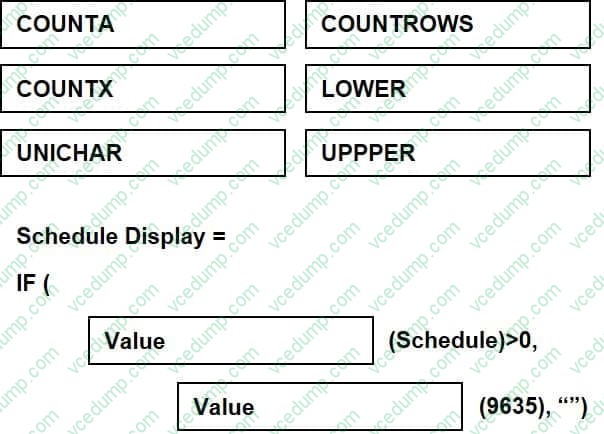
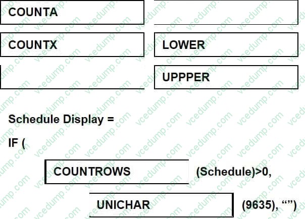
You add a matrix visualization, and then you add Employee to the rows and Scheduled to columns.
Which DAX formula should you use to create the measure that will display the checkboxes? To answer, drag the appropriate values to the correct targets. Each value may be used once, more than once, or not at all. You may need to drag the split bar between panes or scroll to view content.
NOTE: Each correct selection is worth one point.
Select and Place:
-
Question 37:
You need to create a dashboard in the Power BI service to display data from a PubNub source. What should you do?
A. Add a Microsoft SQL Server Analysis Services (SSAS) data source that uses Connect live and create a report. Pin the report to a dashboard.
B. Create an app workspace and publish the workspace to a dashboard.
C. Add a Microsoft Azure SQL database data source that uses DirectQuery and create a report. Pin the report to a dashboard.
D. Add a custom streaming data tile to a dashboard. -
Question 38:
Your company has a custom line-of-business application named SalesApp.
The developers of SalesApp want to push data into the Power BI service to create several visualizations.
You need to ensure that the developers can push the data from SalesApp to the Power BI service.
What should you do?
A. Go to portal.azure.com and create a web app.
B. Go to dev.powerbi.com/apps and register an application.
C. Go to app.powerbi.com/admin-portal and click Publish to web.
D. Go to app.powerbi.com and create an app workspace. -
Question 39:
You manage a Power BI model has a table named Sales and product.
You need to ensure that a sales team can view only data that has a CountryRegionName value of United States and a ProductCategory value of Clothing.
What should you do from Power BI Desktop?
A. From Power BI Desktop, create a new role that has the following filter.[countryRegionName]= "United States" andand [ProductCategory]= "Clothing"
B. Add the following filters in Query Editor.CountryRegionName is United StatesProductCategory is Clothing
C. From Power BI Desktop, create a new role that has the following filters.[CountryRegionName]= "United States"
D. Add the following filters to a report.CountryRegionName is United SatesProductCategory is Clothing -
Question 40:
You have a sales report in an app workspace. The report displays a map of sales by location and a bar chart of sales by year. The report has a slicer to filter the data by year.
You need to create a dashboard that contains visualizations. The solution must ensure that you can use the slicer to filter the data by year.
What should you do?
A. Pin each visualization to the dashboard, and then add a web content tile.
B. Add a page level filter, and then pin each visualization to the dashboard.
C. Publish the app workspace.
D. Pin the report as a live page.
Related Exams:
-
62-193
Technology Literacy for Educators -
70-243
Administering and Deploying System Center 2012 Configuration Manager -
70-355
Universal Windows Platform – App Data, Services, and Coding Patterns -
77-420
Excel 2013 -
77-427
Excel 2013 Expert Part One -
77-725
Word 2016 Core Document Creation, Collaboration and Communication -
77-726
Word 2016 Expert Creating Documents for Effective Communication -
77-727
Excel 2016 Core Data Analysis, Manipulation, and Presentation -
77-728
Excel 2016 Expert: Interpreting Data for Insights -
77-731
Outlook 2016 Core Communication, Collaboration and Email Skills
Tips on How to Prepare for the Exams
Nowadays, the certification exams become more and more important and required by more and more enterprises when applying for a job. But how to prepare for the exam effectively? How to prepare for the exam in a short time with less efforts? How to get a ideal result and how to find the most reliable resources? Here on Vcedump.com, you will find all the answers. Vcedump.com provide not only Microsoft exam questions, answers and explanations but also complete assistance on your exam preparation and certification application. If you are confused on your 70-778 exam preparations and Microsoft certification application, do not hesitate to visit our Vcedump.com to find your solutions here.