Exam Details
Exam Code
:RHIAExam Name
:Registered Health Information AdministratorCertification
:AHIMA CertificationsVendor
:AHIMATotal Questions
:1826 Q&AsLast Updated
:Jul 09, 2025
AHIMA AHIMA Certifications RHIA Questions & Answers
-
Question 1701:
A distribution is said to be positively skewed when the mean is
A. bimodal.
B. multimodal.
C. shifted to the left.
D. shifted to the right.
-
Question 1702:
You want to graph the number of patients admitted to three different medical staff services of each day of the last month. Because you have a large number of observations (one for each day of the month) and you want to be able to compare the observations for each of the three services on one data display, your best choice is a
A. table.
B. bar chart.
C. line graph.
D. histogram.
-
Question 1703:
You have just constructed the chart displayed below: The names of the hospital services are hard to read. The best way to deal with this problem would be to
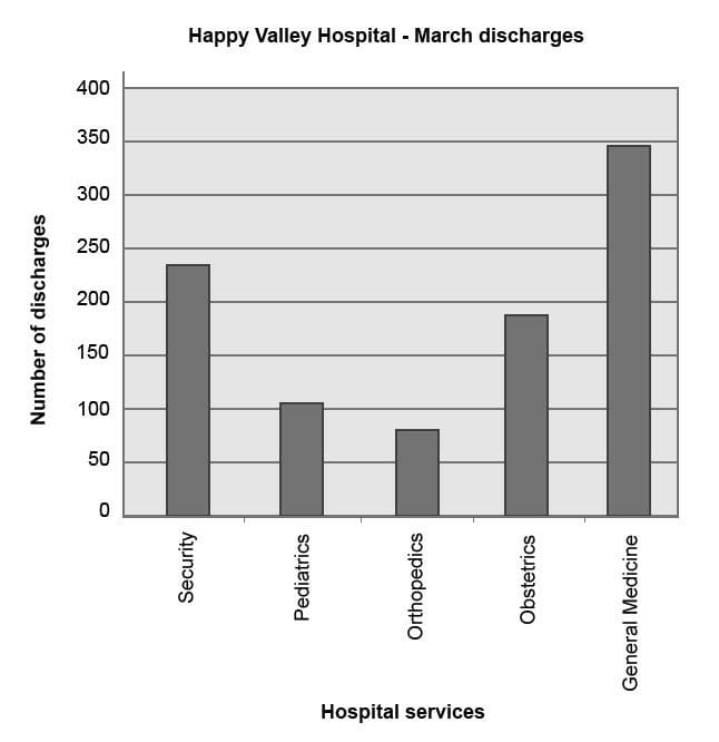
A. construct a line graph instead of a bar chart.
B. use a column chart instead of a bar chart.
C. plot your primary variable along the x axis.
D. divide the data into two charts.
-
Question 1704:
The data display below is a
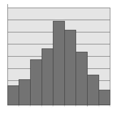
A. bar chart, which is commonly used to display continuous data.
B. bar chart, which is commonly used to display discrete data.
C. histogram, which is commonly used to display continuous data.
D. histogram, which is commonly used to display discrete data.
-
Question 1705:
The data display below is a
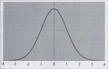
A. normal distribution or curve.
B. positive skewed curve.
C. negative skewed curve.
D. heterogenous curve.
E. none of the above.
-
Question 1706:
What conclusion can you make from the pie graph below?
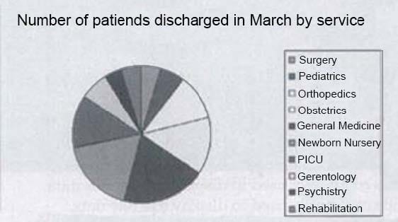
A. A pie graph should not be used because there are too many categories for effective display.
B. A pie graph should not be used, because the data are representational instead of quantitative
C. A pie graph should not be used, because the data are qualitative instead of quantitative.
D. A pie graph is a good choice and is often used to display this kind of data.
-
Question 1707:
You are trying to improve communications with your staff by posting graphs of signs statistics on the employee bulletin board. You recently calculated the percentage of employees spend on each of six major tasks. Because you would like the employees to appreciate each task as a percentage of their whole day, you will post these figures using a
A. line graph.
B. bar graph.
C. scatter diagram.
D. pie graph.
-
Question 1708:
The graph below can best be described as A. sequential.
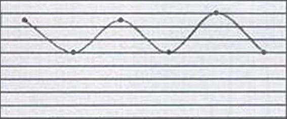
B. multimodal.
C. substitutional
D. erratic.
-
Question 1709:
Looking at the data represented in the scatter diagram below, you would conclude that there is
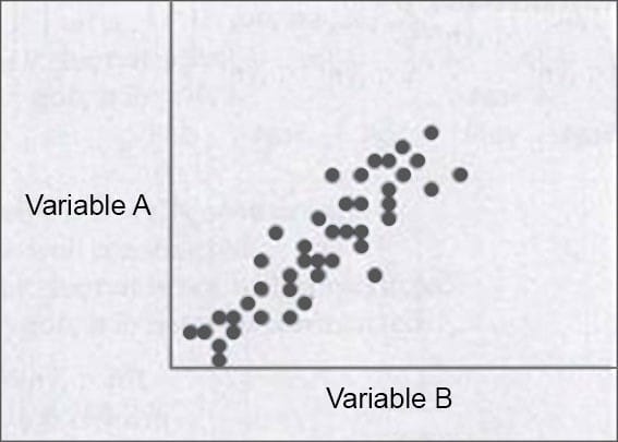
A. no correlation between Variable A and Variable B
B. a positive correlation between Variable A and Variable B
C. a negative correlation between Variable A and variable B
D. a cause and effect relationship between Variable A and Variable B
-
Question 1710:
Look at the graph grid displayed above. If you want to follow accepted principles for graph construction, you'll follow the three-quarter-high rule. That means the
A. height of the graph should be three-fourths the length of the graph.
B. length of the graph should be three-fourths the height of the graph.
C. height of the graph should display three-fourths of the data in the graph.
D. length of the graph should display three-fourths of the data in the graph.
Tips on How to Prepare for the Exams
Nowadays, the certification exams become more and more important and required by more and more enterprises when applying for a job. But how to prepare for the exam effectively? How to prepare for the exam in a short time with less efforts? How to get a ideal result and how to find the most reliable resources? Here on Vcedump.com, you will find all the answers. Vcedump.com provide not only AHIMA exam questions, answers and explanations but also complete assistance on your exam preparation and certification application. If you are confused on your RHIA exam preparations and AHIMA certification application, do not hesitate to visit our Vcedump.com to find your solutions here.