RHIA Exam Details
-
Exam Code
:RHIA -
Exam Name
:Registered Health Information Administrator -
Certification
:AHIMA Certifications -
Vendor
:AHIMA -
Total Questions
:1826 Q&As -
Last Updated
:Jul 12, 2026
AHIMA RHIA Online Questions & Answers
-
Question 1691:
Sally has been diagnosed with panic attacks and is prescribed Xanax. She has been taking the medication as prescribed by her physician for 3 days and is now having hallucinations. Her physician advises her to stop taking the medication and her symptoms abate. Her doctor determines that the hallucinations were due to the Xanax.
A. 292.12, E939.4, 300.01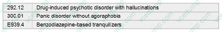
B. 292.12
C. E939.4, 292.12
D. 300.01, 292.12 -
Question 1692:
The Correct Coding Initiative (CCI) edits contain a listing of codes under two columns titled, "comprehensive codes" and "component codes." According to the CCI edits, when a provider bills Medicare for a procedure that appears in both columns for the same beneficiary on the same date of service.
A. code only the component code.
B. do not code either one.
C. code only the comprehensive code.
D. code both the comprehensive code and the component code. -
Question 1693:
Based on the budget illustrated below, what is the monthly budget variance percent for supplies?
A. 13.6%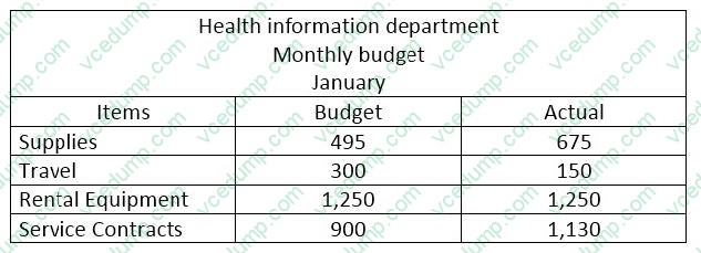
B. 36%
C. 26.6%
D. 11.9% -
Question 1694:
In a filing system containing a total of 1,255 records, 48 records are identified as misfiles. What is the percentage of filing accuracy for this area?
A. 26.14%
B. 74%
C. 3.82%
D. 96% -
Question 1695:
In creating a new form or computer view, the designer should be most driven by
A. QIO standards.
B. medical staff bylaws.
C. needs of the users.
D. flow of data on the page or screen. -
Question 1696:
Which one of the following is NOT a pathophysiological factor in anemia?
A. excessive RBC breakdown.
B. lack of RBC maturation
C. loss of bone marrow function
D. loss of spleen function -
Question 1697:
Intrauterine pregnancy, twins, 33 weeks. Premature rupture of membranes. Spontaneous delivery of premature twins, vertex presentation, both live born.
A. 644.21, 658.11, 651.01, V27.2, 73.59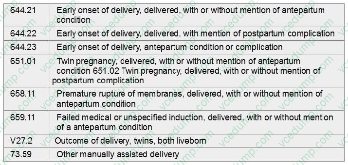
B. 644.22, 659.11, V27.2
C. 644.23, 658.11, 651.02, 73.59
D. 658.11, 651.01, V27.2, 73.59 -
Question 1698:
Your hospital has purchased a number of outpatient facilities. You have been assigned to chair an interdisciplinary committee that will write record retention policies for the new corporation. You begin by telling the committee their primary consideration when making retention decisions must be
A. space considerations.
B. statutory requirements.
C. provider preferences.
D. professional standards. -
Question 1699:
The name given to the error committed when the null hypothesis is rejected and it is actually true is: The name given in
A. type II error.
B. selection bias.
C. type I error.
D. alternative hypothesis. -
Question 1700:
In the number "99-0001" listed in a tumor registry accession register, what does the prefix "99" represent?
A. the number of primary cancers reported for that patient
B. the year the case was entered into the database of the registry
C. the sequence number of the case
D. the stage of the tumor based upon the TNM system of staging
Tips on How to Prepare for the Exams
Nowadays, the certification exams become more and more important and required by more and more enterprises when applying for a job. But how to prepare for the exam effectively? How to prepare for the exam in a short time with less efforts? How to get a ideal result and how to find the most reliable resources? Here on Vcedump.com, you will find all the answers. Vcedump.com provide not only AHIMA exam questions, answers and explanations but also complete assistance on your exam preparation and certification application. If you are confused on your RHIA exam preparations and AHIMA certification application, do not hesitate to visit our Vcedump.com to find your solutions here.