Single choice
When using a data source that has relationships, how can you add a join between two or more tables?
Reveal answer details Close answer details
Correct answerA
Tableau · TDS-C01
Preview real exam questions, verified answers and available explanations before choosing a study plan.
|
Single choice
When using a data source that has relationships, how can you add a join between two or more tables? Reveal answer details Close answer detailsCorrect answerA
Single choice
While borders and background colors let you visually highlight items on a dashboard, _________ lets you precisely space items. Reveal answer details Close answer detailsCorrect answerA Explanation Padding lets you precisely space items on dashboard, while borders and background colors let you visually highlight them. Inner padding sets the spacing between item contents and the perimeter of the border and background color; outer padding provides additional spacing beyond the border and References:
Single choice
Which of the following can you use to create a Histogram? Reveal answer details Close answer detailsCorrect answerB Explanation A histogram is a chart that displays the shape of a distribution. A histogram looks like a bar chart but groups values for a continuous measure into ranges, or bins. The basic building blocks for a histogram are as follows: 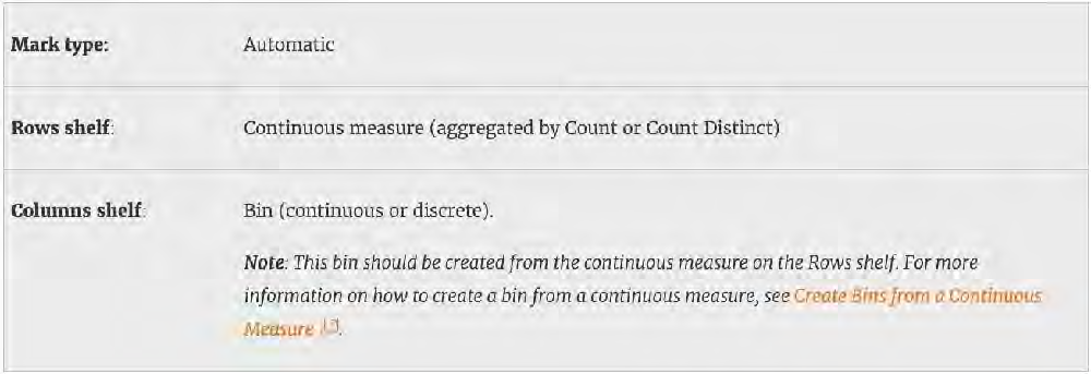 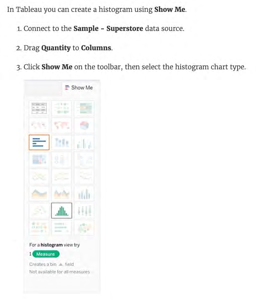 Demo : 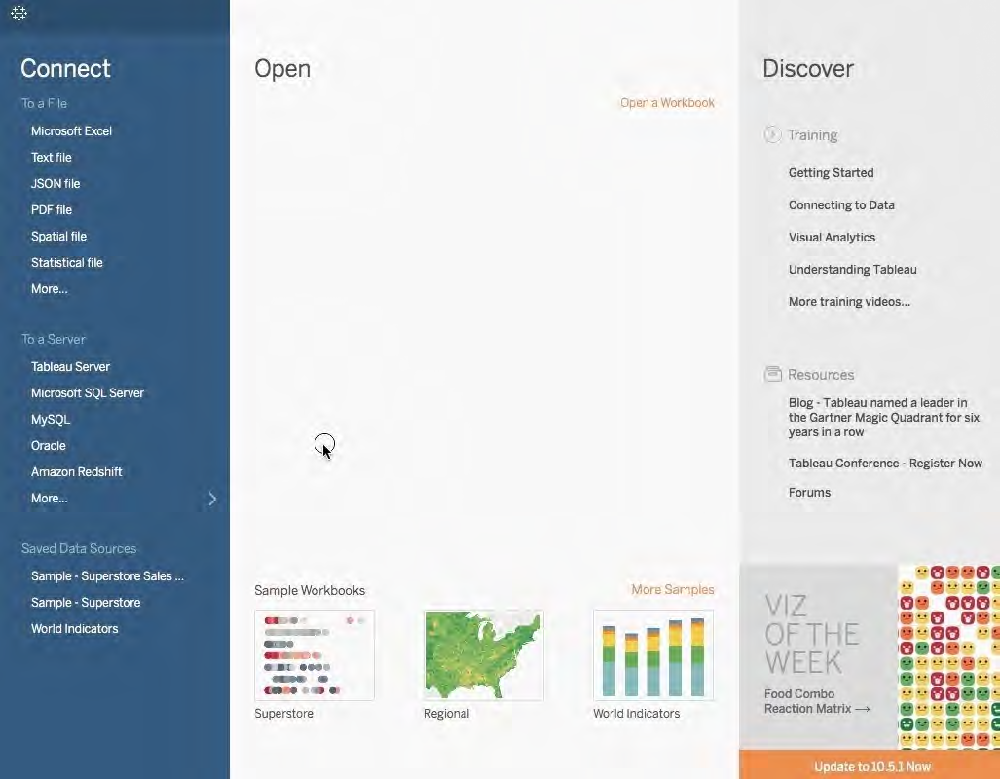 References:
Multiple choice
You want to save a view as an image that you can paste into a Microsoft Word document. Which two statements accurately describe exporting a view as an image? (Choose two.) Reveal answer details Close answer detailsCorrect answersC, D
Single choice
________________ can only create header. _______________ will create header and axis both. Reveal answer details Close answer detailsCorrect answerA Explanation References:
Single choice
Which of the following is a valid way to create Sets in Tableau? Reveal answer details Close answer detailsCorrect answerA Explanation There are two types of sets: dynamic sets and fixed sets. The members of a dynamic set change when the underlying data changes. Dynamic sets can only be based on a single dimension. 1) In the Data pane, right-click a dimension and select Create > Set. General: Use the General tab to select one or more values that will be considered when computing the set. References:
Multiple choice
What are two benefits of using a live connection to a data source as compared to an extract? (Choose two.) Reveal answer details Close answer detailsCorrect answersB, C
Multiple choice
When creating an extract, what are three options for specifying how much data to extract? (Choose three.) Reveal answer details Close answer detailsCorrect answersA, B, E
Single choice
Are animations enabled by default in Tableau? Reveal answer details Close answer detailsCorrect answerA Explanation No, by default, animations are not enabled in Tableau. We can animate visualizations to better highlight changing patterns in your data, reveal spikes and outliers, and see how data points cluster and separate. When you author animations, you can choose between two different styles: simultaneous or sequential. 1) Simultaneous animations 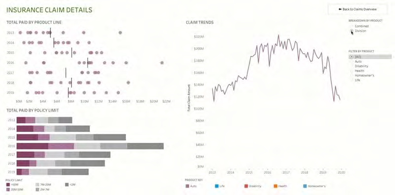 2) Sequential animations To Animate visualizations in a workbook: For Duration, choose a preset, or specify a custom duration of up to 10 seconds. For Style, choose Simultaneous to play all animations at once or Sequential to fade out marks, move and sort them, and then fade them in. 3) To override workbook defaults for a particular sheet, change the settings under Selected Sheet. 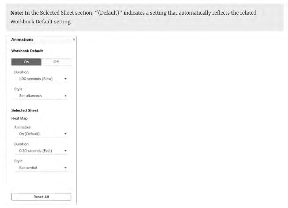 References:
Single choice
For creating variable sized bins we use __________________ Reveal answer details Close answer detailsCorrect answerA Explanation One way to view a measure in Tableau Desktop is to split it into bins. You can think of bins as buckets based on a range of values. For example, say you have a measure that represents age. Instead of aggregating the measure to calculate the average age, you can bin the measure to define age groups: 0?, 6?0, 11?5, and so on. Then you can count the number of people in each age group. Create a calculated field for variable bin size Step 1 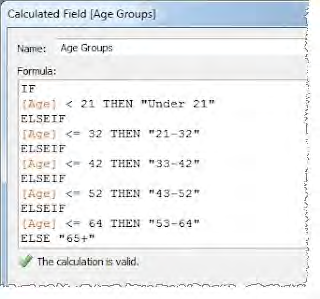 References:
Single choice
True or False: You get different filtering options for categorical and quantitative data Reveal answer details Close answer detailsCorrect answerA Explanation Yes! We get different options for filtering depending on whether we use a categorical data (think dimension) or quantitative data (think measure). 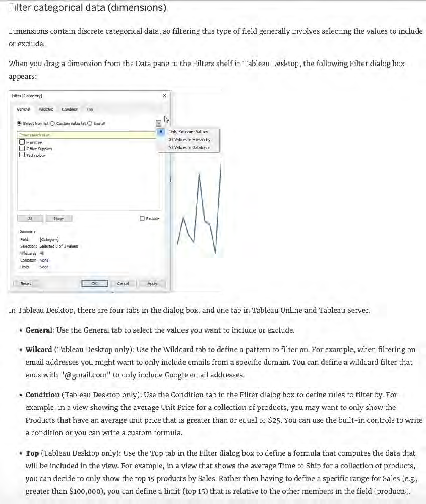 Important Note: Each tab adds additional definitions to your filter. For example, you can select to exclude values under the General tab, and also add limits under the Top tab. Selections and configurations from both tabs are applied to your filter.At any time, you can see the definitions of your filter under Summary on the General tab. 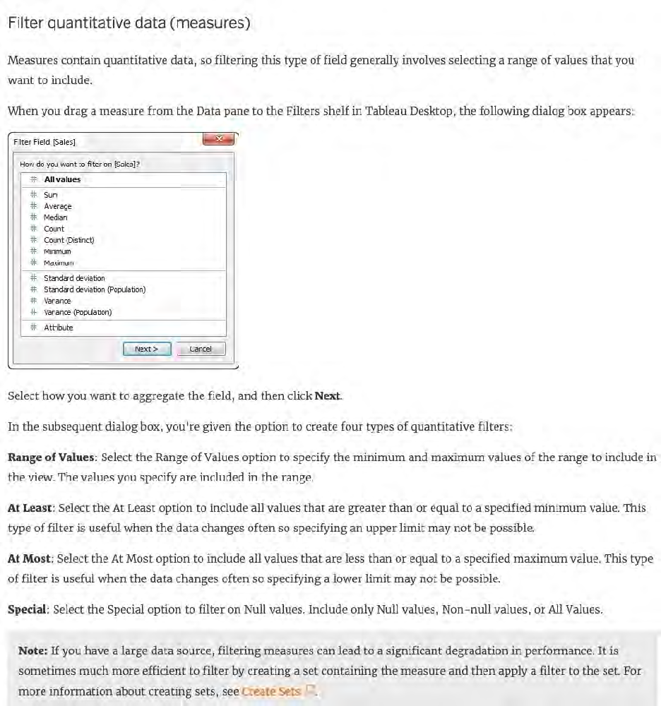 Note: If you have a large data source, filtering measures can lead to a significant degradation in performance. It is sometimes much more efficient to filter by creating a set containing the measure and then apply a filter to the set. For more information about creating sets, see Create Sets References:
Single choice
What do the colours Blue and Green represent in Tableau? Reveal answer details Close answer detailsCorrect answerA Explanation Important question! If you selected Dimension and Measure, don't worry! It is a very common mistake. But we're here to learn aren't we? When you connect to a new data source, Tableau assigns each field in the data source as dimension or measure in the Data pane, depending on the type of data the field contains. You use these fields to build views of your data. 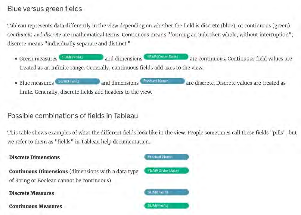 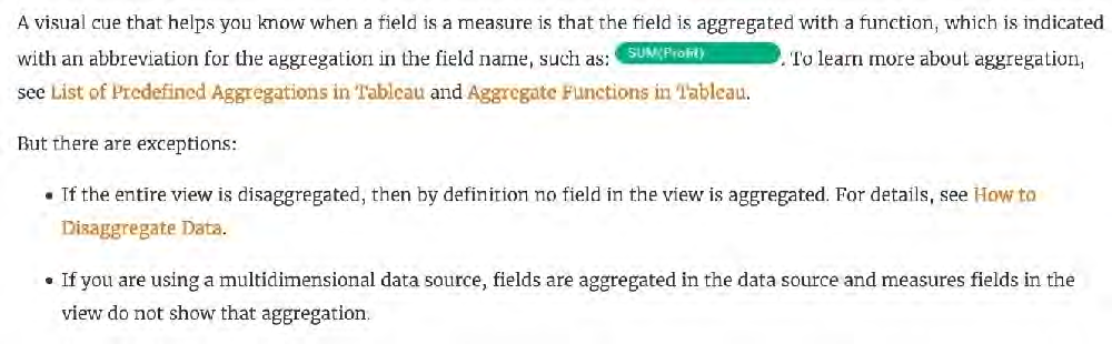 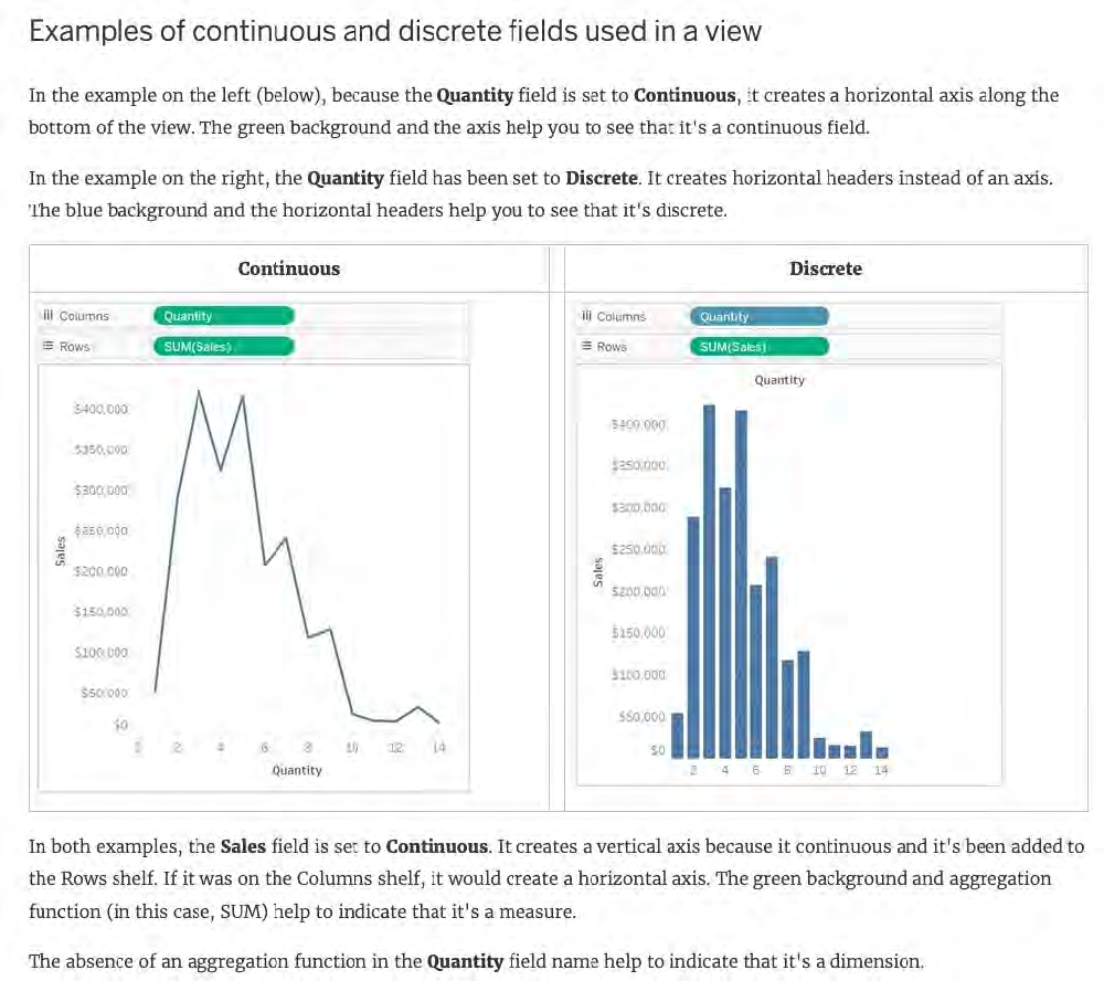 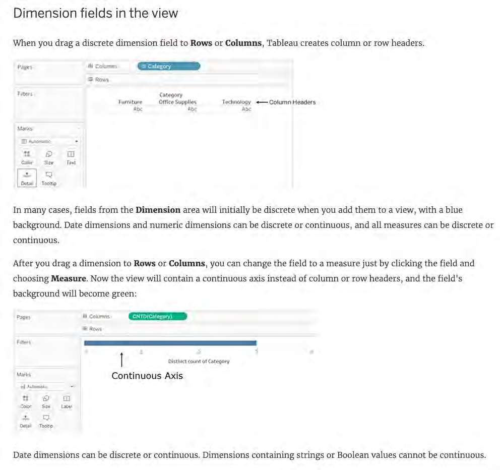 References:
Single choice
You just added this field to the Columns shelf.  What will this create? Reveal answer details Close answer detailsCorrect answerB Explanation We know that continuous fields will always create an axis, so options stating 'header' are automatically eliminated. For our question, see below: 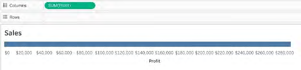 Teams Had the question asked us to place this pill on the Rows shelf instead, we would've gotten a different answer:
Single choice
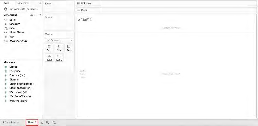 You clicked Sheet 1 from the data source page, and now you have opened the Tableau Desktop workspace as shown above. What is the main thing that you do here? Reveal answer details Close answer detailsCorrect answerC Explanation The Tableau workspace consists of menus, a toolbar, the Data pane, cards and shelves, and one or more sheets. Sheets can be worksheets, dashboards, or stories. For details on dashboard or story workspaces, see Create a Dashboard or The Story Workspace. 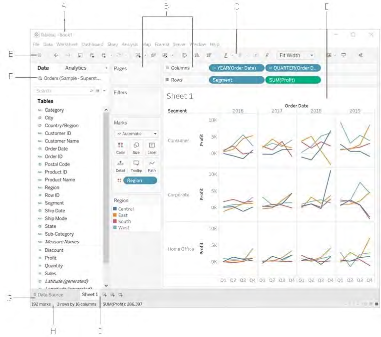 The main thing you do in the workspace is to create visualisations to analyze your data. Renaming data fields, cleaning the data, previewing the data can all be done in the Data source window. References:
Single choice
True or False: All rows from both tables are returned in an INNER JOIN Reveal answer details Close answer detailsCorrect answerB Explanation The INNER JOIN keyword selects all rows from both tables as long as there is a match between the columns. Consider 2 tables "Orders" and "Customers". If there are records in the "Orders" table that do not have matches in "Customers", these orders will not be shown! 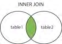 References:
Single choice
True or False: A LEFT JOIN or INNER JOIN creates a row each time the join criteria is satisfied, which can result in duplicate rows. One way to avoid this is to use data blending instead. Reveal answer details Close answer detailsCorrect answerA Explanation Joins combine tables by adding more columns of data across similar row structures. This can cause data loss or duplication if tables are at different levels of detail, and joined data sources must be fixed before analysis can begin. 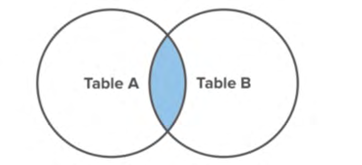 Inner join 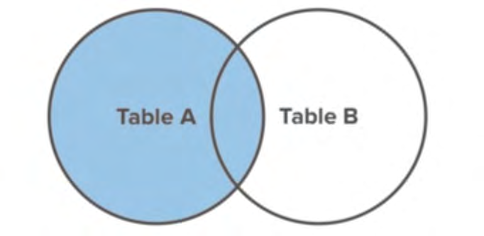 Left Join Blends, unlike relationships or joins, never truly combine the data. Instead, blends query each data source independently, the results are aggregated to the appropriate level, then the results are presented visually together in the view. References:
Single choice
You have a scatter plot visualization. What should you do to configure the visualization as a density map? Reveal answer details Close answer detailsCorrect answerB
Single choice
You have a dashboard. You want users to be able to identify specific marks that appear in multiple sheets without losing the context of all the data in the view. Which dashboard action should you use? Reveal answer details Close answer detailsCorrect answerC
Single choice
Which of the following is NOT a valid official data source in Tableau Desktop? Reveal answer details Close answer detailsCorrect answerC Explanation Presently, there is no official way to connect your data in Firebase directly with Tableau Desktop. But then again, it is a workaround and not an official out-of-the-box solution. The following are the available Data sources available as of now: 1) Server 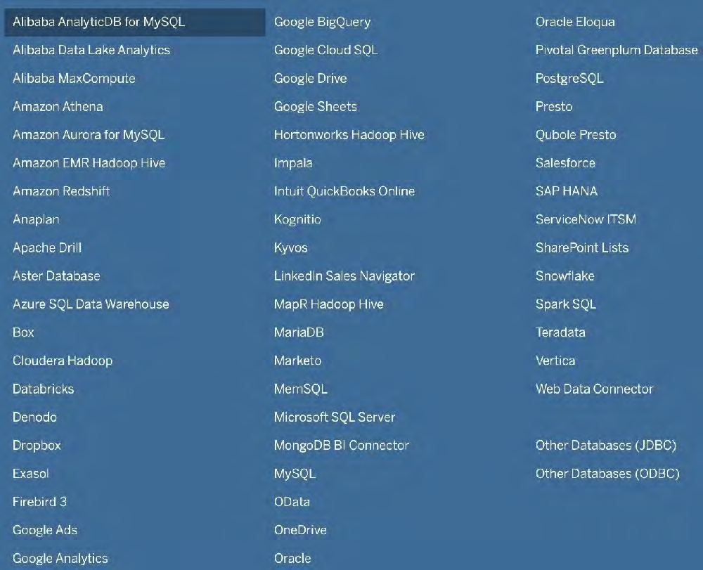 2) File 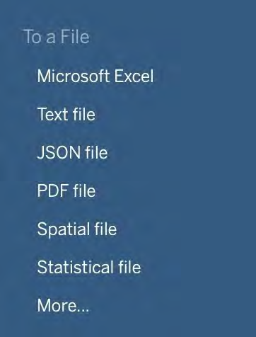
Single choice
Using the CoffeeChain table, create a Dual Axis chart showing the Sales (Bar chart) and Profit (Line Chart) for each Product type. What was the Profit for the Herbal Tea product type in 2013? Reveal answer details Close answer detailsCorrect answerC Explanation If you answered this question quickly and correctly, you're well prepared for the exam! Most students stumble while creating a Dual axis chart, so go ahead and give yourself a pat on the back! To create a dual axis chart for the problem mentioned: 1) Drag Product Type to the column shelf, and Sales and Profit to the Row shelf:  2) Now, to focus on 2013, drag Date to the filter shelf and select only 2013: 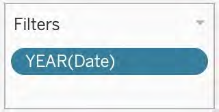 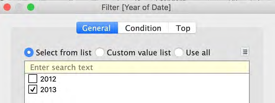 3) Now, click on the Profit pill in the Rows Shelf, and select dual axis: 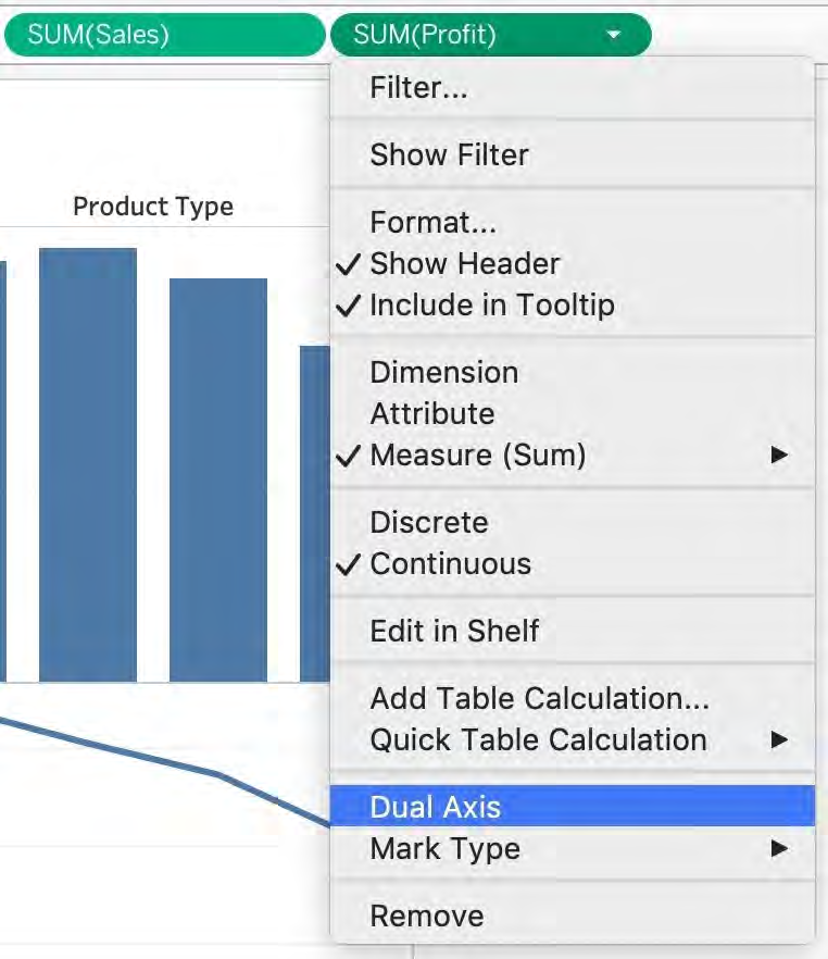 4) Now, in the marks shelf, choose Sales, and change the chart type to bar. Similarly, for Profit, change the chart type to Line. 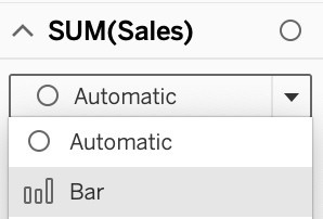 Now the chart looks like this: 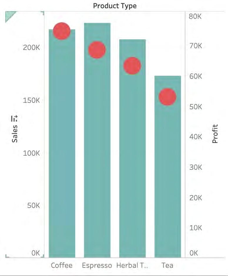 Now we change the Profit chart type to line: 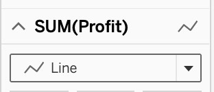 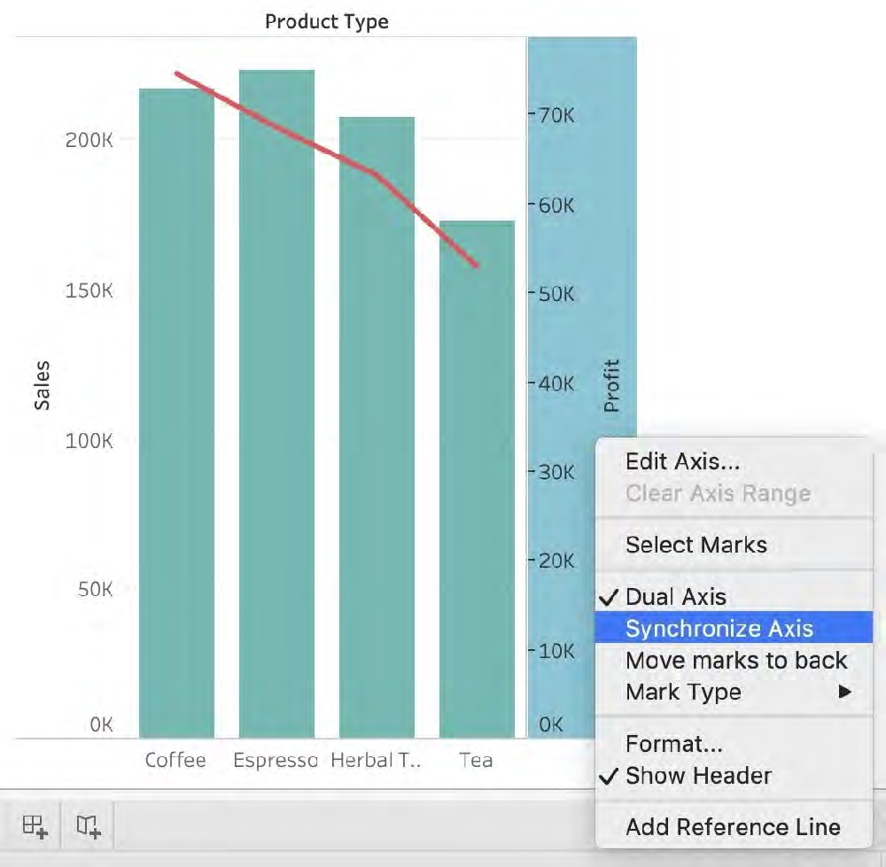 5) Finally, we synchronise the axis as follows: Right click on the axis, and choose 'Synchronise axis' 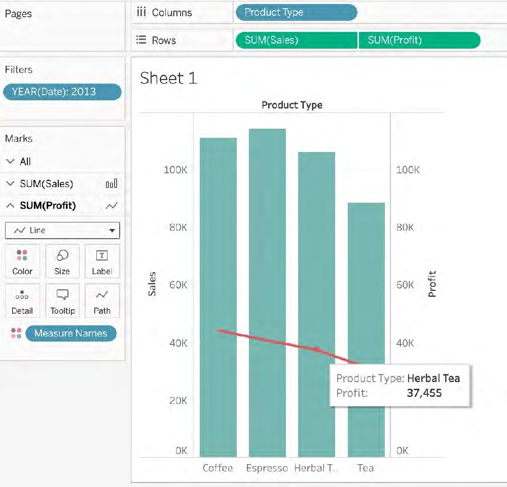
Multiple choice
Which of the following 2 fields CANNOT be deleted in Tableau? Reveal answer details Close answer detailsCorrect answersB, C Explanation Measure names and values CANNOT be deleted in Tableau like other columns can. These are auto-generated.
Single choice
You have the following visualization. 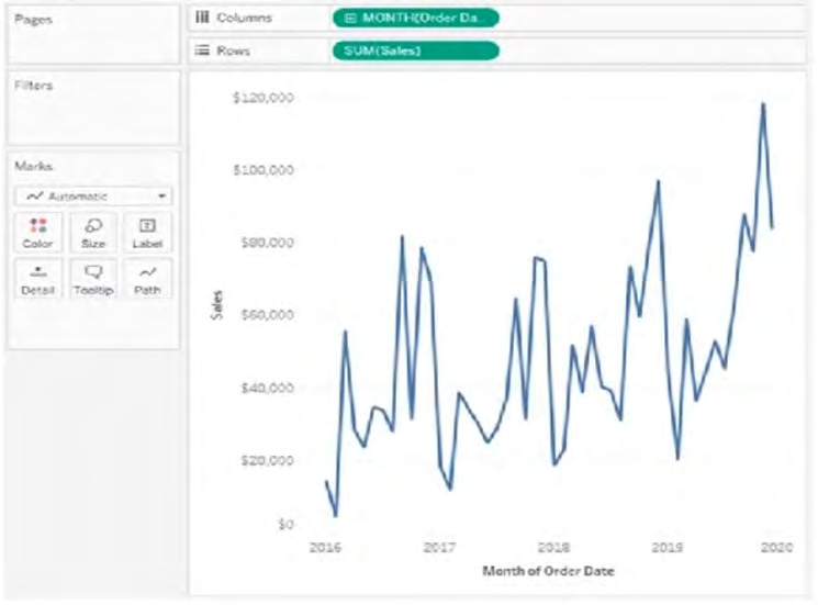 Where should you place a field named Region to show multiple distinct lines on the same axis? Reveal answer details Close answer detailsCorrect answerB
Single choice
If you see the following Filter, then you're working with _______________________ Larger image 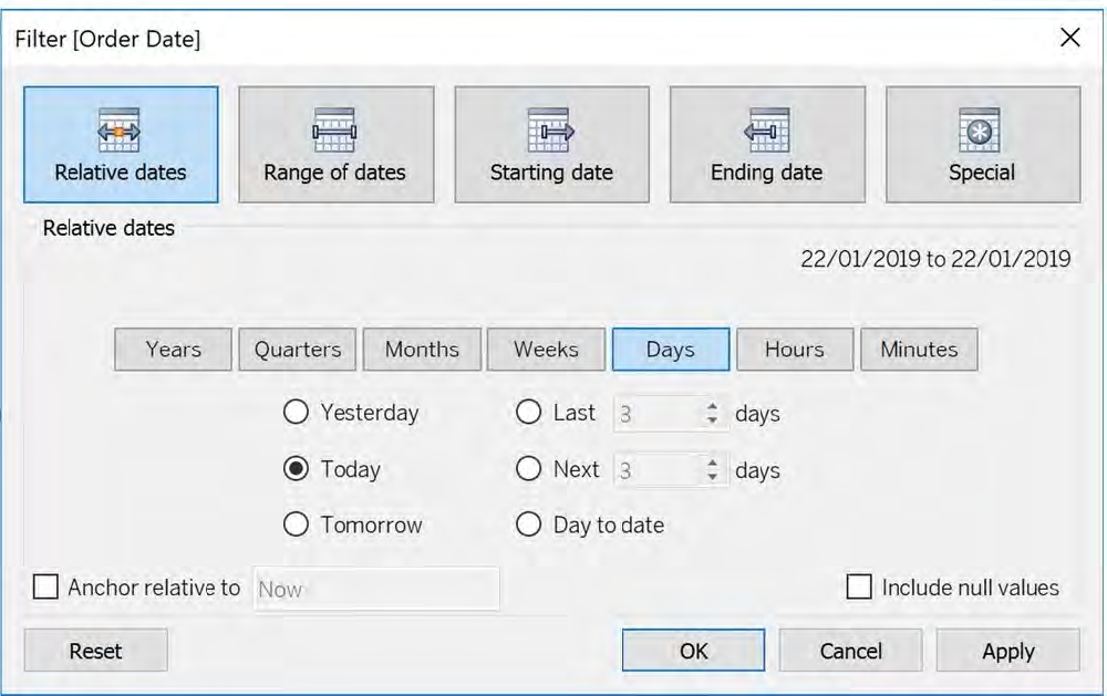 Reveal answer details Close answer detailsCorrect answerD Explanation Dates in Tableau will behave differently depending on whether they are a Datepart (blue) or a Datevalue (green). This affects how the axes display/behave and also how visualisations such as line charts will display. The difference essentially boils down to Dateparts behaving like a dimension as opposed to a measure which is how Datevalues behave. This means that Dateparts behave like discrete categories on the view whereas Datevalues are more like continuous numeric values. Dateparts are discrete and they behave the same as dimension filters. If all dates are used on the filter then each individual date will be a datepart that can be selected/excluded. This is the same for each level of date, if datepart months is placed on filters January to December will be tick-able options in the filter. 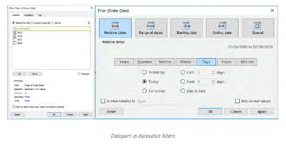 References:
Single choice
Which Sub-Category had the least Profit in the Office Supplies category? Reveal answer details Close answer detailsCorrect answerA Explanation To reach the correct answer, follow the steps below: 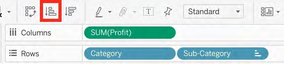 1) Drag Category, and sub-category to the row shelf. Drag Profit to the Column shelf 2) Click the Sort-ascending icon as shown above, to sort the profits from least to greatest as shown: 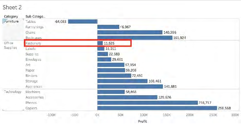 As we can see, Fasteners has the least Profit in the Office Supplies Category, and hence is our correct answer!
Single choice
You have a continuous numeric measure named Sales. Which chart type is created when you double-click the Sales measure? Reveal answer details Close answer detailsCorrect answerB
Multiple choice
Which two options can you use to change the device layout of a dashboard? (Choose two.) Reveal answer details Close answer detailsCorrect answersB, C
Single choice
What is created by a calculated field that has a formula of SUM(Sales) / SUM(Profit)? Reveal answer details Close answer detailsCorrect answerA
Multiple choice
Which of the following are valid ways to trigger actions for a Dashboard? Reveal answer details Close answer detailsCorrect answersA, C, D Explanation Whenever we want to add actions to a Dashboard, we can trigger then in the following 3 ways: 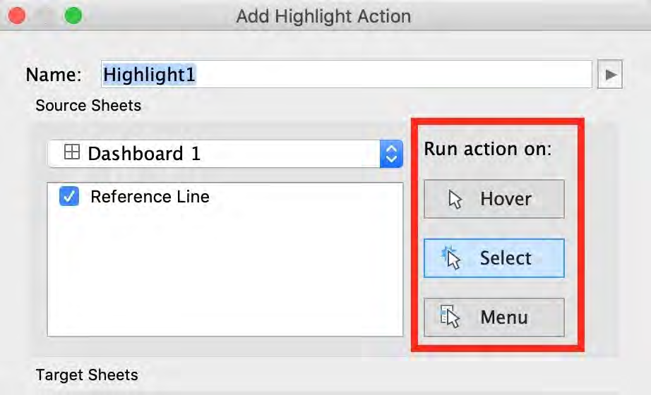 References:
Single choice
The View Data window displays as much of the data as possible by default, up to _______________ rows. Reveal answer details Close answer detailsCorrect answerC Explanation The View Data window displays as much of the data as possible by default, up to 10,000 rows. This can be increased though, if you wish to. 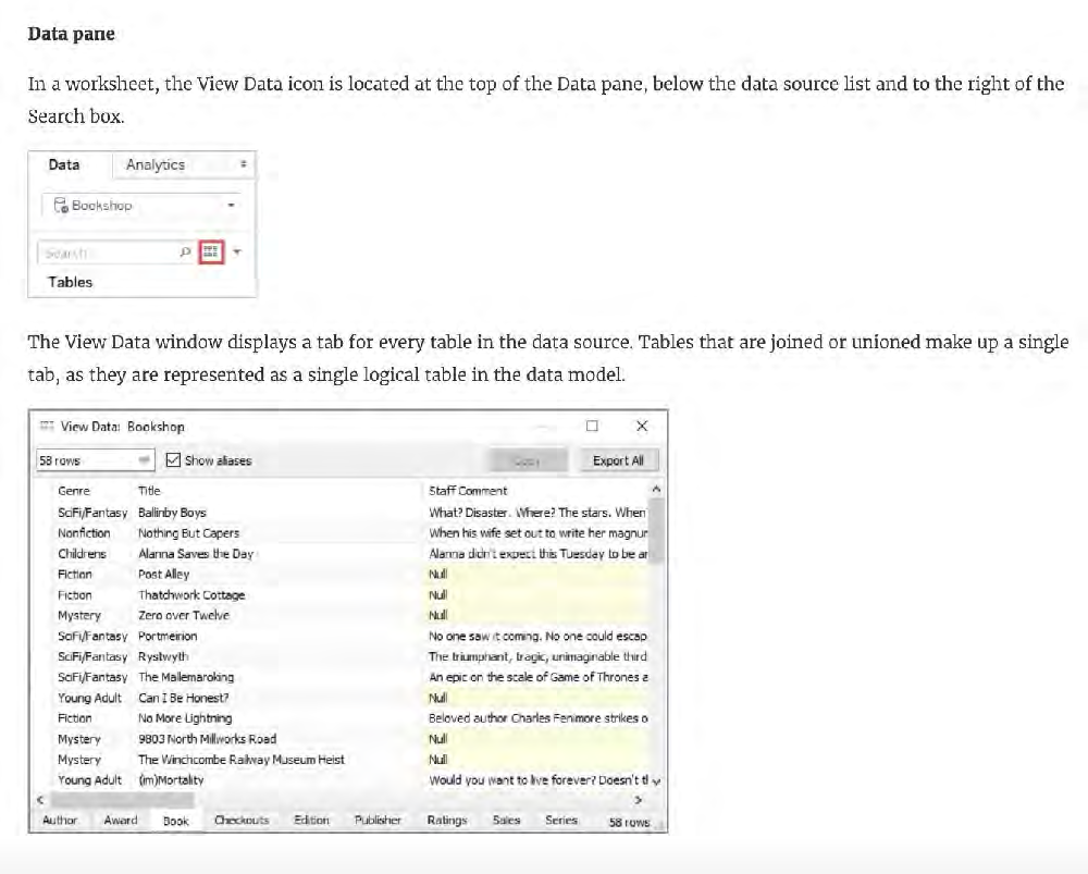 Read more:
Single choice
A union of two tables usually results in an Reveal answer details Close answer detailsCorrect answerB Explanation From the official Tableau documentation: You can union your data to combine two or more tables by appending values (ROWS) from one table to another. To union your data in Tableau data source, the tables must come from the same connection. 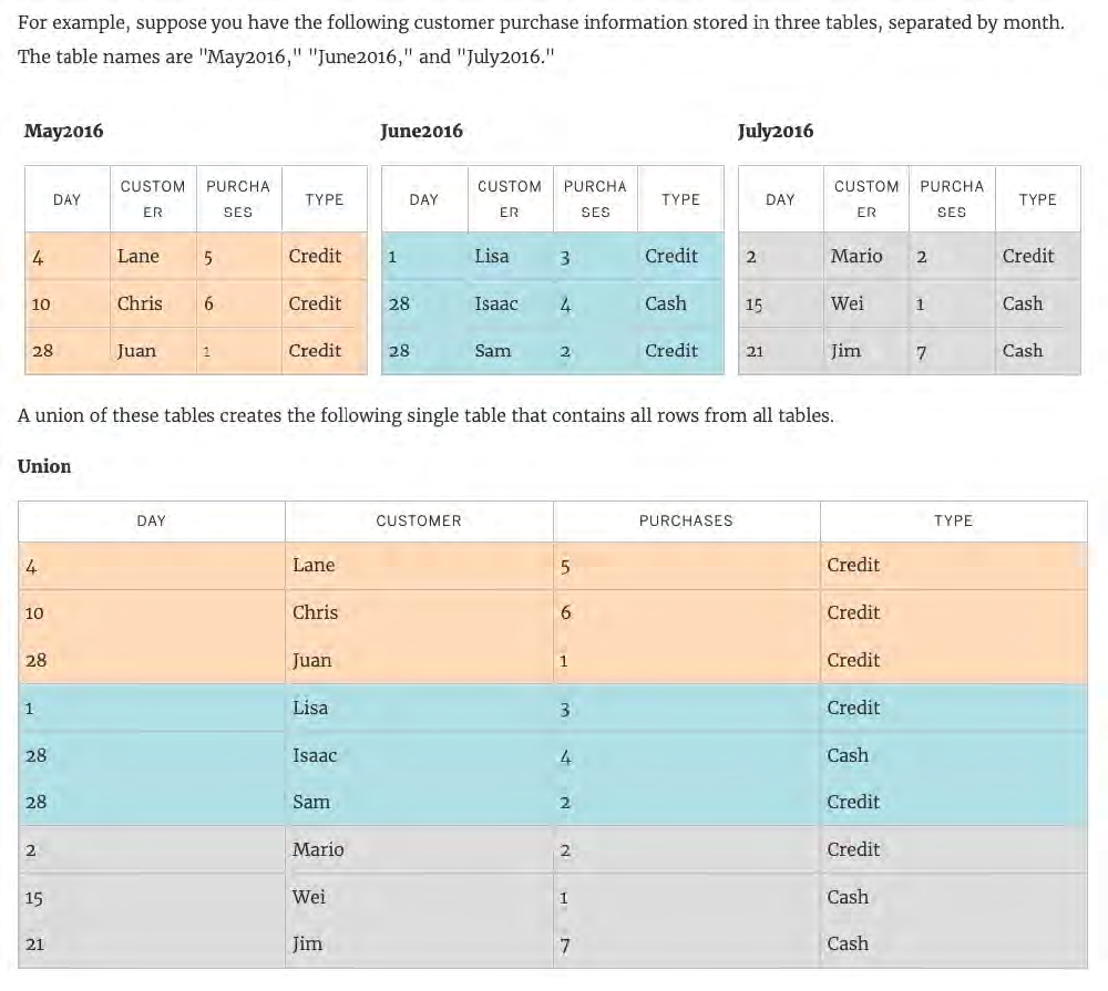 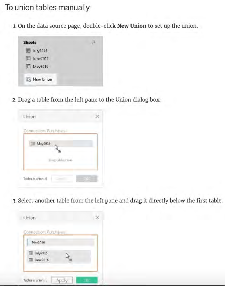  References:
Single choice
Which of the following is a discrete date part? Reveal answer details Close answer detailsCorrect answerA
Multiple choice
Which of the following are valid ways to show Mark Labels in the visualisation? Reveal answer details Close answer detailsCorrect answersA, B, D Explanation The following showcase how you can show mark labels. Using the Sample Superstore dataset: 1) Let's create a Bar chart showing the sales for each sub-category: 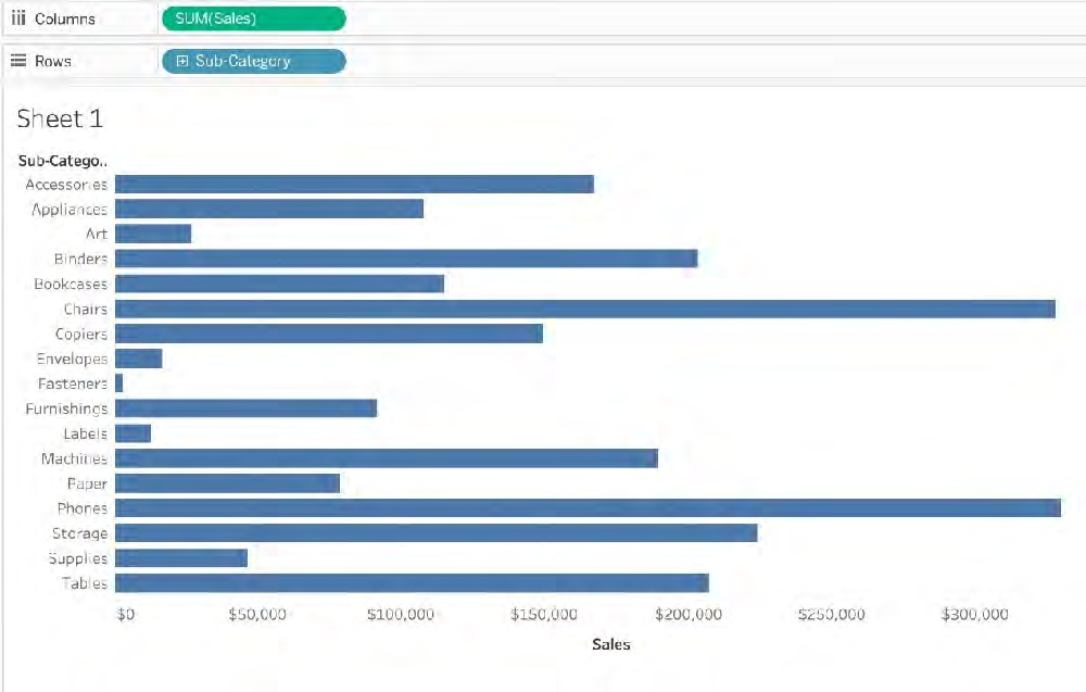 2) Now you can show labels by: 2.1) Click on Show Mark Labels Icon in the Toolbar ( easiest ) 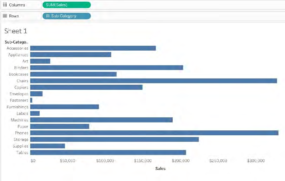 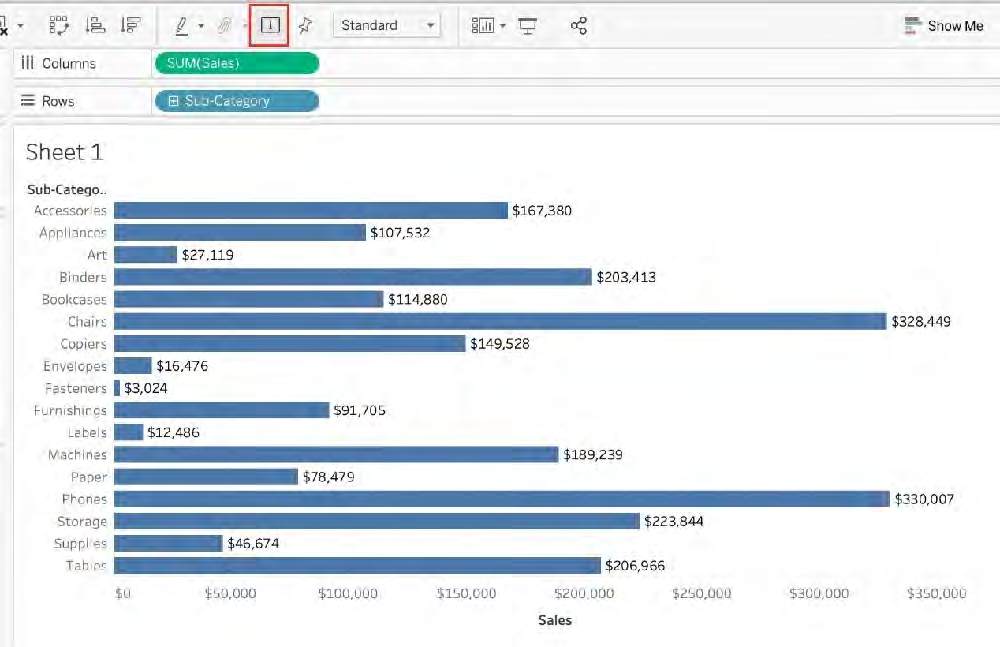 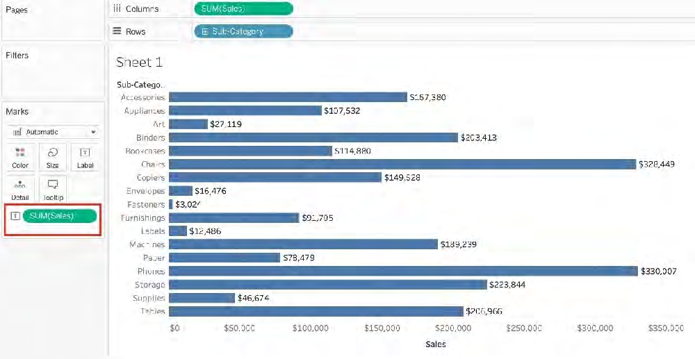 2.2) Drag Sales to the Text icon in the Marks Card 2.3) Click on Analysis-> Show mark labels from the Tableau menu bar
Single choice
What does the following icon do in Tableau? Reveal answer details Close answer detailsCorrect answerD Explanation The icon shown is used to add a new Dashboard! From the official documentation: 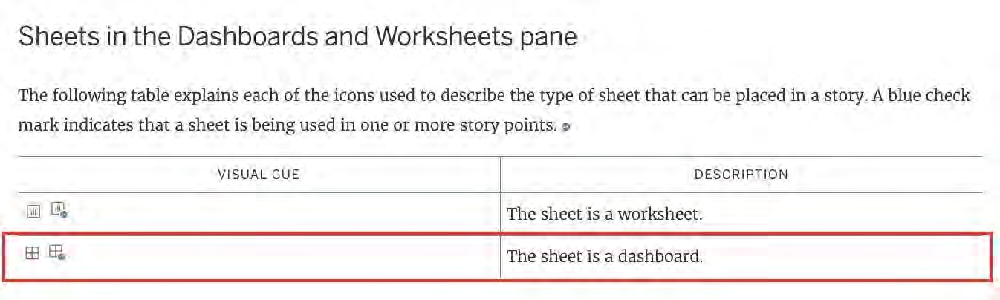 References:
Single choice
You view the relationship canvas shown in the following exhibit. 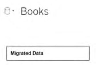 What does Migrated Data indicate? Reveal answer details Close answer detailsCorrect answerA
Single choice
How does Tableau know at which level to aggregate values? Reveal answer details Close answer detailsCorrect answerA Explanation In Tableau, you can aggregate measures or dimensions, though it is more common to aggregate measures. Whenever you add a measure to your view, an aggregation is applied to that measure by default. The type of aggregation applied varies depending on the context of the view. When you add a measure to the view, Tableau automatically aggregates its values. Sum, average, and median are common aggregations; for a complete list, see List of Predefined Aggregations in Tableau. The You can change the aggregation for a measure in the view from its context menu: 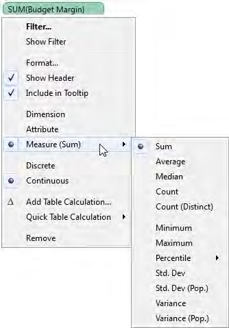 References:
Single choice
When there are both negative and positive values for a field, the default range of values will use two color ranges. This is known as a ______________ palette. Reveal answer details Close answer detailsCorrect answerC Explanation 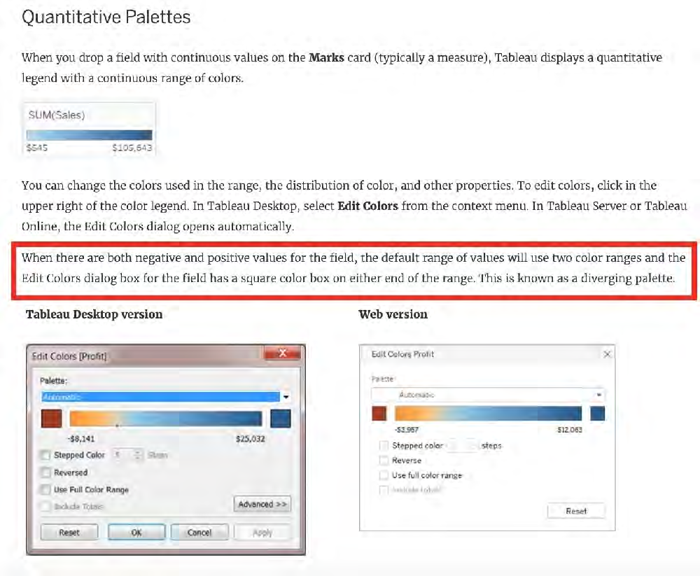 References:
Multiple choice
What are two ways that dimensions and measures are different? (Choose two.) Reveal answer details Close answer detailsCorrect answersB, C
Single choice
Using the Time Series Table, create a Line chart showing the Monthly Year over Year Growth for the Sales, broken down by Assortment. Reveal answer details Close answer detailsCorrect answerA Explanation Drag Assortment and Year ID (choose Discrete Month) to Columns shelf, and Sales to the Columns Shelf.
Single choice
Which of the following is a benefit of using a Tableau Data Source (. Reveal answer details Close answer detailsCorrect answerB Explanation The following are the official definitions from the Tableau documentation for the various file types: 1) .tds (Tableau Data Source)-To not contain the actual data but rather the information necessary to connect to the actual data as well as any modifications you've made on top of the actual data such as 2) .twbx ( Tableau packaged workbook)-To create a single zip file that contains a workbook along with any supporting local file data and background images. This is great for sharing your work with others who don't have access to the original data. 3) Extract (.hyper or .tde) ?To create a local copy of a subset or entire data set that you can use to share data with others, when you need to work offline, and improve performance. 3) (.twb) Workbooks ?To hold one or more worksheets, plus zero or more dashboards and stories. References:
Single choice
In which situation should you save a workbook as a PDF document? Reveal answer details Close answer detailsCorrect answerD
Single choice
How do you identify a continuous field in Tableau? Reveal answer details Close answer detailsCorrect answerB Explanation When you connect to a new data source, Tableau assigns each field in the data source as dimension or measure in the Data pane, depending on the type of data the field contains. You use these fields to build views of your data. 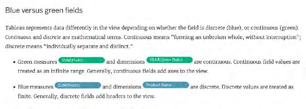 References:
Single choice
When creating a dashboard for multiple devices, which of the following Device options are available in the Device Preview section? Reveal answer details Close answer detailsCorrect answerC Explanation The following options are available in the Device preview section when creating a Dashboard: 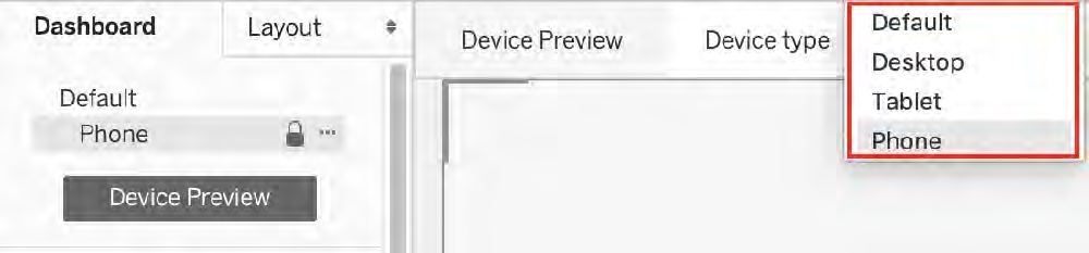 References:
Single choice
Which of the following chart type makes use of 'binned' data? Reveal answer details Close answer detailsCorrect answerC Explanation A histogram is a chart that displays the shape of a distribution. A histogram looks like a bar chart but groups values for a continuous measure into ranges, or bins. 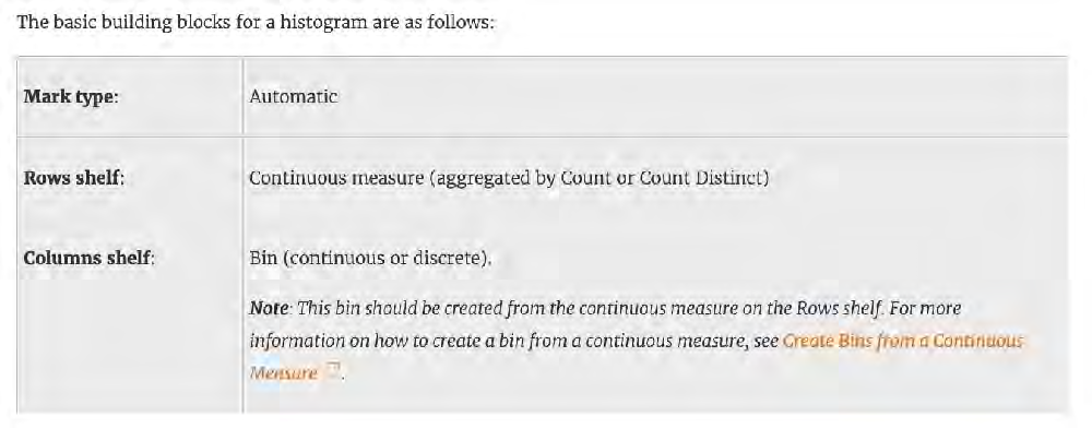 References:
Single choice
When is an axis created for the visualisation in Tableau? Reveal answer details Close answer detailsCorrect answerD Explanation An Individual Axis in Tableau is obtained by adding a continuous into Rows or Columns Shelf. Example: 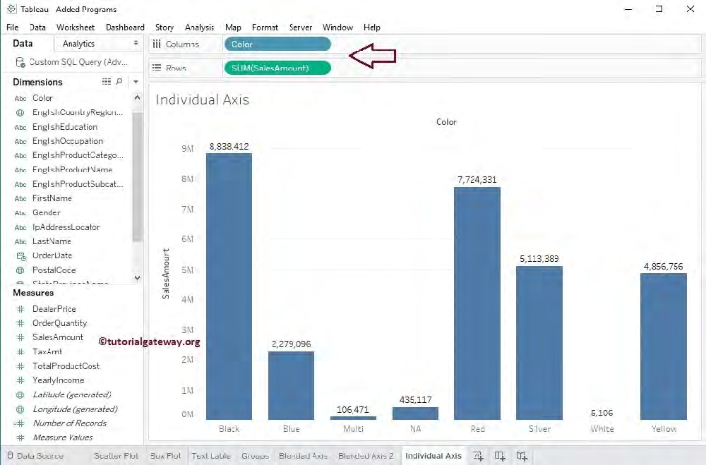 Next, we drag and Drop one more measure value, i.e., Total Product Cost from Measures Region to Rows Shelf. Because it is a Measure value, Total Product Cost is aggregated to default Sum. From the below screenshot, you can observe that Tableau has created an individual axis for each measure (continuous field). 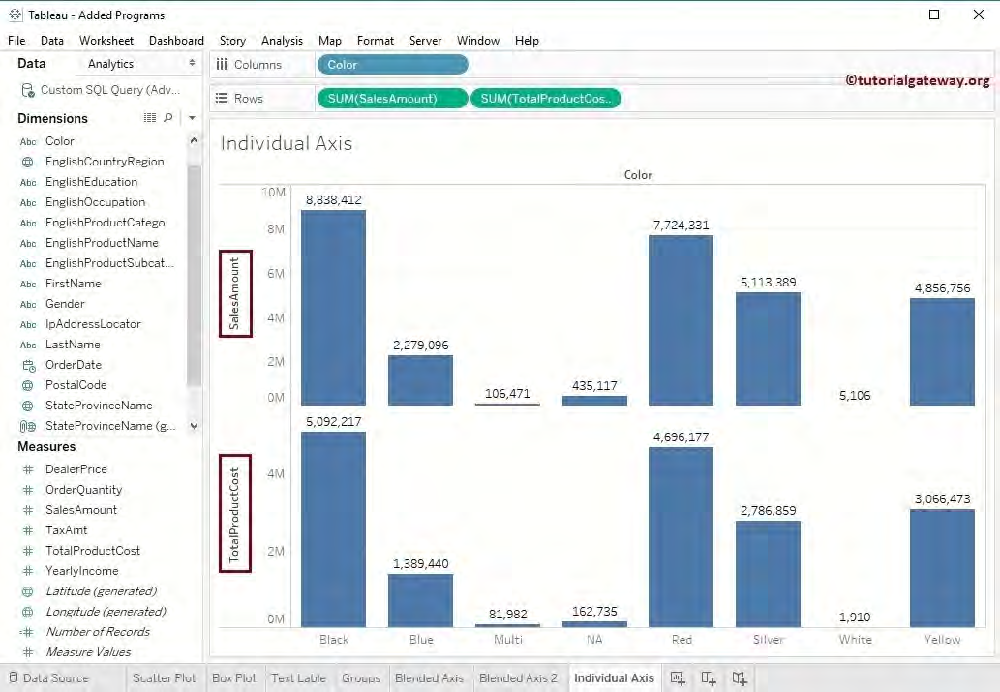 References:
Single choice
Using the CoffeeChain table, create a crosstab showing the Total Expenses per State and add Column Grand Totals to the view. Now group the states of New York, California and Washington. What percent of the total sales does this group contribute? Reveal answer details Close answer detailsCorrect answerC Explanation We need to use the concept of Groups for this question. Follow along: 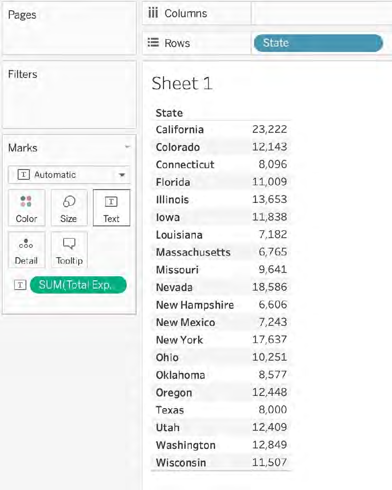 2) Now, remove the SUM aggregation from Total Expenses, and add a quick table calculation-> Percent of 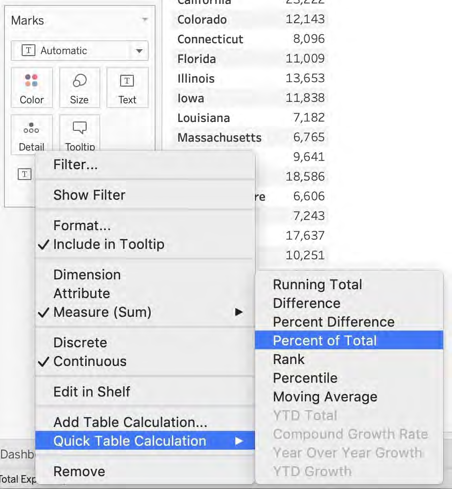 3) Next, Select the States of New York, California and Washington-> And then click the paperclip icon: 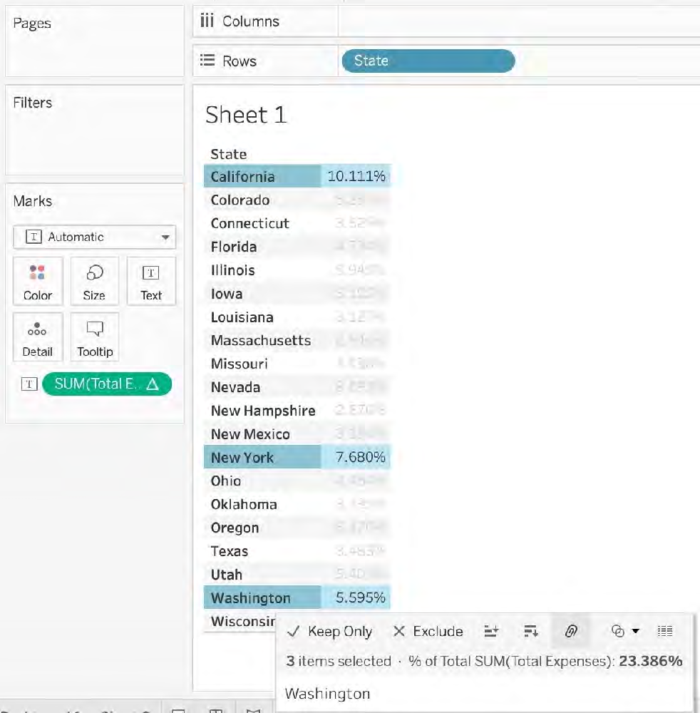 We can see the answer already : 23.386% in the view above (even before grouping!) 4) Finally, we get the following view and our answer:
Single choice
Which of the following returns the Absolute Value of a given number? Reveal answer details Close answer detailsCorrect answerA Explanation From the official Tableau website: 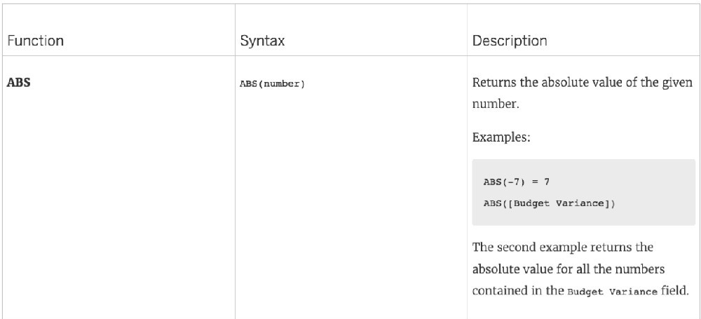 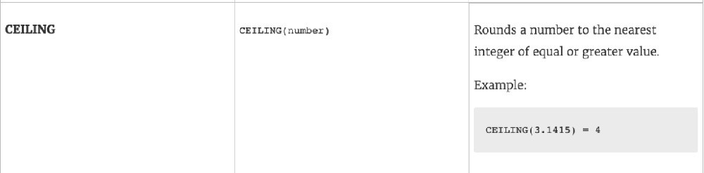 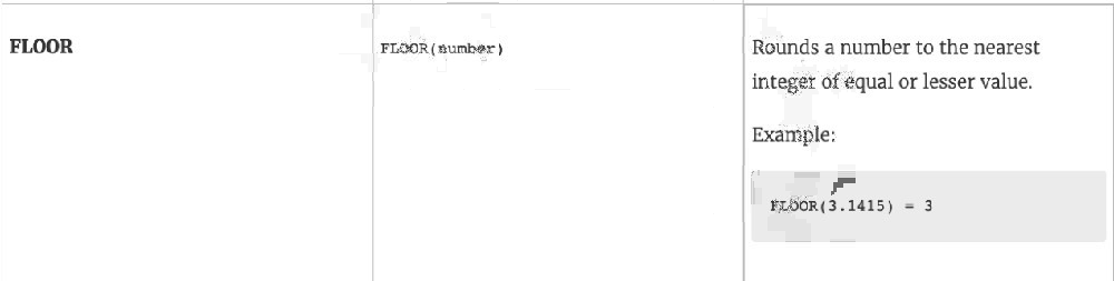 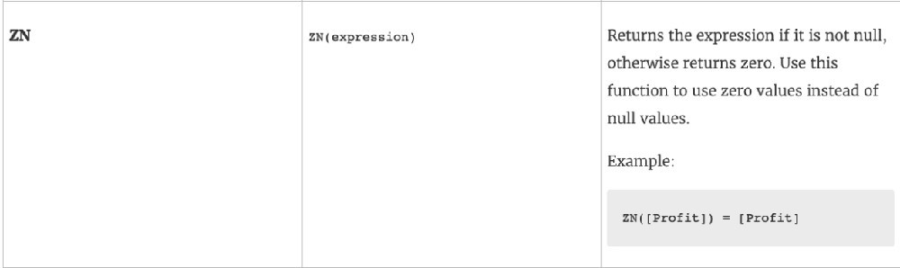 References:
Single choice
When you drop a continuous field on Color, Tableau displays a quantitative legend with a ___________ range of colors. Reveal answer details Close answer detailsCorrect answerC Explanation When you drop a discrete field on Color in the Marks card, Tableau displays a categorical palette and assigns a color to each value of the field. When you drop a continuous field on Color, Tableau displays a quantitative legend with a continuous range of colors. Web version: 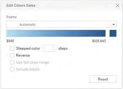 Desktop Version: 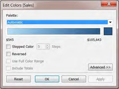 For more information about color palettes, see Color Palettes and Effects.
Single choice
By default, what does Tableau do when you connect to a data source? Reveal answer details Close answer detailsCorrect answerB Explanation Before you can build a view and analyze your data, you must first connect Tableau to your data. Tableau supports connecting to a wide variety of data, stored in a variety of places. By default, when you connect a data source to Tableau, Tableau will create a live connection to the data. Live connection refers to a data source that contains direct connection to underlying data, which provides real-time or near real-time data. With a live connection, Tableau makes queries directly against the database or other source, and returns the results of the query for use in a workbook. Users can create live connections and then share them on Tableau Server so that other Tableau users can use the same data using the same connection and filtering settings. References:
Single choice
The icon associated with the field that has been grouped is a ______________ Reveal answer details Close answer detailsCorrect answerA Explanation You can create a group to combine related members in a field. The icon associated with a group is a paper clip! 
Multiple choice
Which three elements are included in a packaged workbook (. Reveal answer details Close answer detailsCorrect answersA, C, E Explanation The following files are included in packaged workbooks:
Single choice
______________ is a method for appending values (rows) to tables. You can use this method if both tables have the same columns. The result is a virtual table that has the same columns but extends vertically by adding rows of data. Reveal answer details Close answer detailsCorrect answerD Explanation Unioning is the correct answer! 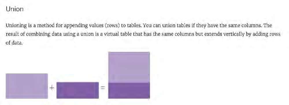 For example, suppose you have the following customer purchase information stored in three tables, separated by month. The table names are "May2016" , "June2016" and "July2016." 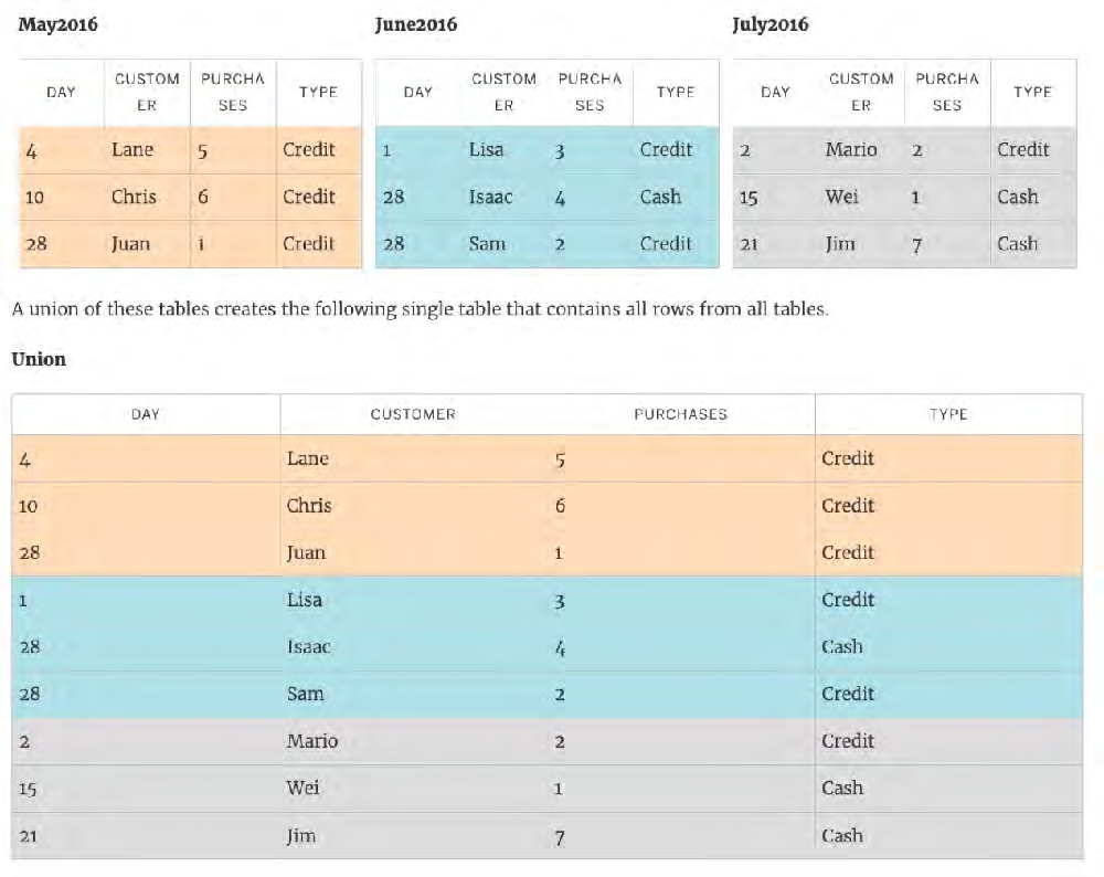 References:
Single choice
A dual axis chart is useful for comparing two measures that ___________. Reveal answer details Close answer detailsCorrect answerB |