Preview real exam questions, verified answers and available explanations before choosing a study plan.
Question 1
Single choice
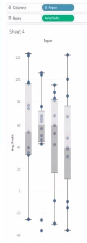
You have the following box plot that shows the distribution of average profits made in every state by region.
Which region has the smallest distribution of profits?
A
South
B
Cast
C
Central
D
West
Reveal answer detailsClose answer details
Correct answerA
Explanation
The box plot visualization displays the distribution of average profits by region. The distribution of profits is represented by the range of the box (interquartile range) and the whiskers (which often represent the total range excluding outliers). From the image provided, the South region has the smallest visible range within its box and the shortest whiskers, indicating the smallest distribution of average profits among the choices provided.
Question 2
Single choice
You are subscribed to several views.
You need to unsubscribe from the views.
What should you use?
A
The My Content area of Tableau web pages
B
The Notifications area of Tableau Prep
C
The Data Source page of Tableau Desktop
D
The Shared with Me page
Reveal answer detailsClose answer details
Correct answerA
Explanation
To unsubscribe from the views, you should use the My Content area of Tableau web pages. This area allows you to manage your subscriptions, as well as your workbooks, views, and data sources. You can select the views you want to unsubscribe from, click Actions, and then click Unsubscribe. You can also change the subscription options, such as the schedule, the format, or the message. References: Create a Subscription to a View or Workbook - Tableau Tableau Certified Data Analyst Study Guide
Question 3
Hotspot
HOTSPOT
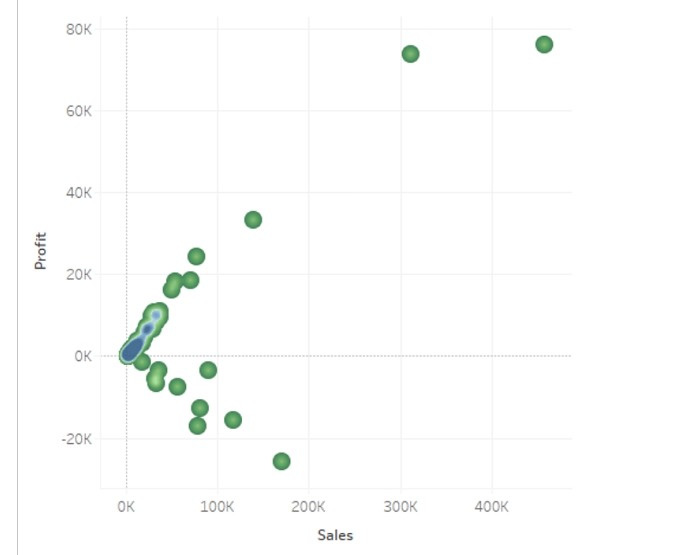
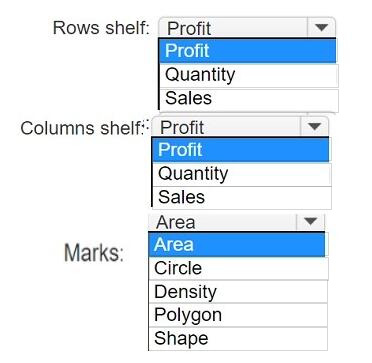
You have a data set that contains three columns named Sales, Profit, and Quantity.
You need to build the following scatter plot.
Reveal answer detailsClose answer details
Explanation
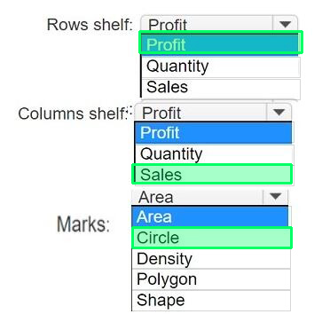
To build the scatter plot shown in the image, you need to place the Profit measure on the Rows shelf and the Sales measure on the Columns shelf. This will create a Cartesian chart with Profit as the y-axis and Sales as the x-axis. Then, you need to change the mark type to Circle on the Marks card. This will display the data points as circles that vary in size according to the Quantity measure. You can also add color or shape encoding to the marks to show additional dimensions or measures in the view. References: Build a Scatter Plot Understanding and Using Scatter Plots Scatter plot in Tableau
Question 4
Single choice
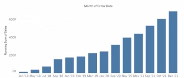
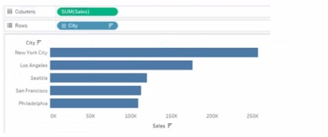
You have the following chart that shows the cumulative of sales from various dates.
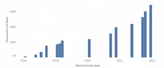
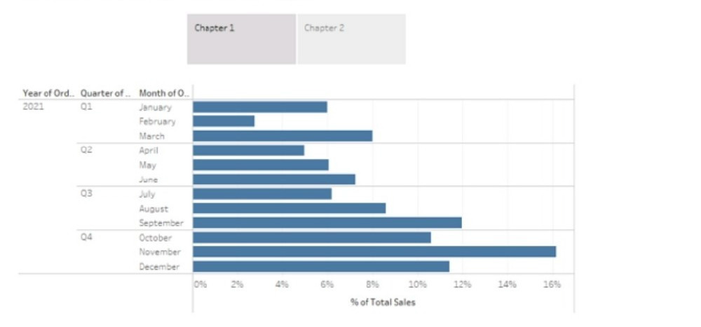
You want the months to appear as shown in the following chart.
What should you do?
A
Convert the date to Exact Date
B
Convert the date to Continuous
C
Select Show Misting Values for the dale
D
Convert the date to Attribute
Reveal answer detailsClose answer details
Correct answerA
Explanation
References: https://help.tableau.com/current/pro/desktop/en-us/dates.htm https://help.tableau.com/current/pro/desktop/en-us/dates_continuous.htm https://help.tableau.com/current/pro/desktop/en-us/formatting.htm To ensure the dates are shown in a continuous axis, you should convert the date to a continuous field. This will display the months in a sequence without any breaks, which is needed for showing a trend over time like the cumulative sum of sales.
Question 5
Single choice
From Tableau Desktop you sign in lo a Tableau Server site.
What appears in the list of available data sources when you search for a published data source?
A
All the data sources published to the site
B
All the data sources published to the Tableau Server
C
All the data sources published to the site within the folders to which you have access
D
All the data sources published to the Tableau Server within the folders to which you have access
Reveal answer detailsClose answer details
Correct answerC
Explanation
When you sign in to a Tableau Server site from Tableau Desktop and search for a published data source, you will see all the data sources published to the site within the folders to which you have access. You will not see data sources published to other sites or folders that you do not have permission to view. You can also filter your search by project, owner, or tag.
References: https://help.tableau.com/current/pro/desktop/en-us/connect_basic.htm https://help.tableau.com/current/pro/desktop/en-us/connect_tableauserver.htm When signed in to Tableau Server from Tableau Desktop, you'll only be able to see the data sources that have been published to the site and are within the folders that you have been granted access to. Tableau's permission and project structure mean that you won't see all data sources from the entire server unless you have permissions to do so.
Question 6
Multiple choice
You want to add a comment to March 2020 as shown in the following visualization.
You have the following sets in a Tableau workbook
1. Top N Customers 2. Customers of 2020 3. Top N Products 4. Sellers of 2020
Which two sets can you combine? Choose two
A
Sellers of 2020
B
Customers of 2020
C
Top N Products
D
Top N Customers
Reveal answer detailsClose answer details
Correct answersB, D
Explanation
To combine two sets, they must have at least one dimension in common. In this case, Customers of 2020 and Top N Customers both have Customer Name as a dimension, so they can be combined using set operations such as union, intersection, or difference. Sellers of 2020 and Top N Products have different dimensions (Seller Name and Product Name), so they cannot be combined.
References: https://help.tableau.com/current/pro/desktop/en-us/sets.htm https://help.tableau.com/current/pro/desktop/en-us/sets_create.htm#combine-sets In Tableau, sets can be combined if they are created from the same dimension. From the options provided, "Customers of 2020" and "Top N Customers" are likely created from the same dimension (Customers). Therefore, these two sets can be combined to create a new set that includes or excludes members based on the combined criteria. Combining sets like "Top N Products" with "Customers of 2020" would not be feasible unless they are from the same dimension, which is typically not the case.
Question 7
Single choice
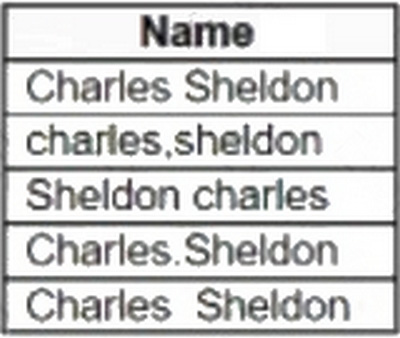
You have the following dataset:
Which grouping option should you use in Tableau Prep to group all five names automatically?
A
Pronunciation
B
Spelling
C
Manual Selection
D
Common Characters
Reveal answer detailsClose answer details
Correct answerD
Explanation
Common Characters: Find and group values that have letters or numbers in common. This option uses the ngram fingerprint algorithm that indexes words by their unique characters after removing punctuation, duplicates, and whitespace. This algorithm works for any supported language. This option isn't available for data roles. For example, this algorithm would match names that are represented as "John Smith" and "Smith, John" because they both generate the key "hijmnost". Since this algorithm doesn't consider pronunciation, the value "Tom Jhinois" would have the same key "hijmnost" and would also be included in the group.
Question 8
Hotspot
HOTSPOT
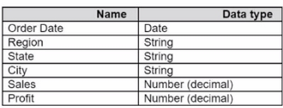
You have a data source that contains the following columns.
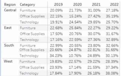
You have the following view that shows the percentage of total sales by category:
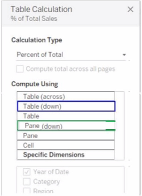
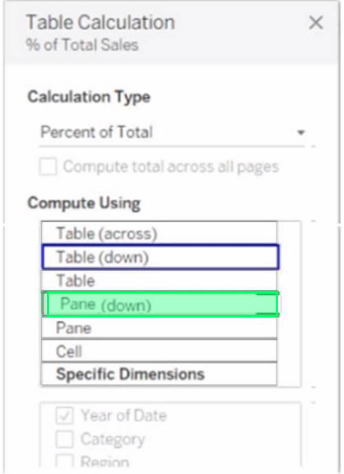
You want to change the calculation to show the percentage of total sales within the categories of every region annually. Which Compute Using option should you use? (Click the appropriate Option in the Answer Area.)
Reveal answer detailsClose answer details
Question 9
Hotspot
HOTSPOT
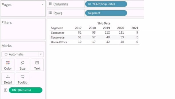
You have the following visualization.
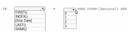
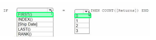
You want the count of Returns displayed only for the first year in the table.
How should you complete the formula in the calculated field? (Use the dropdowns in the Answer Area to select the correct options to complete the formula.)
Reveal answer detailsClose answer details
Explanation
we need to create a calculated field that displays the count of returns only for the first year in the table. To do this, we can use the following formula: IF FIRST () = 0 THEN COUNT (Returns) END This formula uses the FIRST () function, which returns the number of rows from the current row to the first row in the partition. If the current row is the first row, then FIRST () returns 0. The IF statement checks if this condition is true, and if so, it returns the count of returns for that row. Otherwise, it returns NULL. To complete the formula in the calculated field, you should select the following options from the drop-down menus: FIRST ()
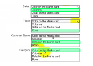
You have a dataset that has four fields named Category. Profit Sates and Customer Name.
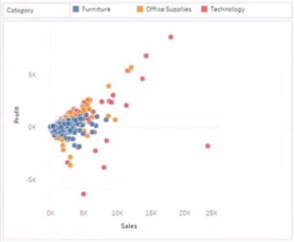
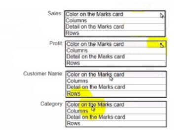
You need to create the following visualization.
Reveal answer detailsClose answer details
Explanation
Sales: B. Columns Profit: D. Rows Customer Name: C. Detail on the Marks card Category: A. Color on the Marks card
To create the visualization, you need to drag Sales to Columns, Profit to Rows, Customer Name to Detail on the Marks card, and Category to Color on the Marks card. This will create a scatter plot that shows the relationship between Sales and Profit for each Customer Name, with different colors for each Category.
You have the Mowing two tables that contains data about the books in a library.
Both tables are incomplete so there are books missing from the tables.
You need to combine the tables.
The solution must ensure that all the data is retained Which type of join should you use?
A
Full outer join
B
Right join
C
left join
D
Inner join
Reveal answer detailsClose answer details
Correct answerA
Explanation
To combine the two tables that contain data about books in a library and ensure that all the data is retained, you should use a full outer join. A full outer join is a type of join that returns all rows from both tables, regardless of whether there is a match or not. If there is no match, null values are filled in for the missing fields.
To perform a full outer join, you need to do the following steps:
Connect to both tables as your data sources in Tableau. You can use either live or extract connections.
Drag one table to the canvas and drop it on top of another table. This will create a join between them based on a common field.
Click on the join icon between the tables and select Full Outer Join from the drop-down list. This will change the join type to full outer join and show all rows from both tables.
Optionally, you can add or remove join clauses by clicking on Add or Remove buttons next to each clause. You can also change or rename fields by clicking on them.
The other types of joins are not correct for this scenario. An inner join returns only the rows that have a match in both tables, which will exclude any books that are missing from either table. A left join returns all rows from the left table and only the matching rows from the right table, which will exclude any books that are only in the right table. A right join returns all rows from the right table and only the matching rows from the left table, which will exclude any books that are only in the left table. References: https://help.tableau.com/current/pro/desktop/en-us/joining_tables.htm https://help.tableau.com/current/pro/desktop/en-us/join_types.htm When combining two datasets that are both incomplete and where it's important to retain all data from both sources, a full outer join is appropriate. This type of join ensures that all records from both tables are included in the combined dataset, even if there are no matching records in the other table.
Question 12
Single choice
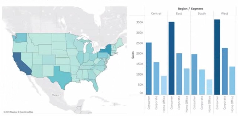
You have the following dashboard that contains two visualizations.
You want to show only visualization at time. Users must be able to switch between visualizations.
What should you me?
A
A parameter and a calculated filed
B
Worksheet actions
C
Showhide buttons
D
Dashboard actions
Reveal answer detailsClose answer details
Correct answerA
Explanation
In Tableau, you can manage the visibility of different visualizations on a dashboard using various techniques. Among the options provided, the most straightforward method to allow users to switch between two visualizations is to use show/hide buttons.
Here's why each option is or isn't suitable for the requirement:
A. A parameter and a calculated field: While it's possible to use a parameter and a calculated field to control which visualization is displayed, it requires creating a calculated field that responds to a parameter and then using that field to filter the view. This method can become complex and is not as user-friendly for simply showing and hiding visualizations.
B. Worksheet actions: Worksheet actions in Tableau typically allow users to interact with the data within a visualization, such as filtering data or highlighting related data points when clicking or hovering. They are not designed to control the visibility of entire visualizations on a dashboard.
C. Show/hide buttons: Show/hide buttons are a feature specifically designed to manage the visibility of dashboard elements. When you create a show/hide button, it can be configured to display or hide a particular visualization, container, or any other dashboard element when clicked. This provides a very intuitive interface for users to switch between visualizations.
D. Dashboard actions: Dashboard actions, like worksheet actions, are used to create interactions between sheets, such as filtering data or navigating to other sheets or URLs based on user interactions. They are not intended for toggling the visibility of visualizations.
Therefore, the correct answer is C. Show/hide buttons as they provide a user-friendly way to switch between visualizations on a dashboard without the need for complex calculations or actions that aren't meant for this purpose. The show/hide button feature is specifically designed for toggling visibility and offers a simple and effective solution for the requirement.
Question 13
Single choice
You are creating a new dashboard.
You need to add a button to the dashboard that allows users to export the dashboard as an image.
Which type of object should you use?
A
Image
B
Ask Data
C
Extension
D
Download
E
Navigation
Reveal answer detailsClose answer details
Correct answerC
Explanation
Extensions in Tableau are web-based programs that can interact with dashboards. To add a button that allows users to export the dashboard as an image, you would use an Extension object. This could be a custom extension designed to trigger the download of the dashboard view as an image.
Question 14
Hotspot
HOTSPOT
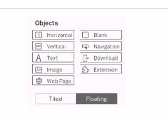
You have a dashboard than contains two sheets named Sheet 1 and Sheet 2.
You want to add an object to the dashboard that users can click to switch to a different dashboard in the workbook.
Which object should you add to the dashboard?
Reveal answer detailsClose answer details
Explanation
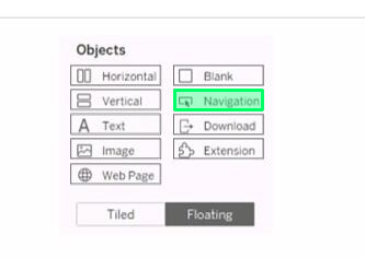
The object that you should add to the dashboard to allow users to switch to a different dashboard in the workbook is Navigation. Navigation objects are used to create links between dashboards or sheets in a workbook. You can add a navigation object to a dashboard by dragging it from the list of objects and dropping it on the dashboard. You can then configure the navigation object to specify the destination dashboard or sheet that you want users to navigate to when they click on it. You can learn more about navigation objects and how to use them in this article: https://help.tableau.com/current/pro/desktop/en-us/dashboards_navigation.htm
Question 15
Single choice
You have a data source that contains 20 tables.
You want the tables to be organized within the Data pane based on the type of data contained within the tables.
What should you use?
A
Folders
B
Hierarchies
C
Sets
D
Groups
Reveal answer detailsClose answer details
Correct answerA
Explanation
To organize the tables in the Data pane based on the type of data contained within the tables, you should use folders. Folders are a way to manually group fields, parameters, sets, or tables in the Data pane according to your preference. You can create folders by right-clicking on the fields or tables you want to group and selecting Folders > Create Folder. You can also drag and drop fields or tables into existing folders. You can name the folders according to the type of data they contain, such as sales, customer, product, etc. Folders can help you find and access the fields or tables you need more easily and efficiently. References: Organize and Customize Fields in the Data Pane - Tableau Tableau Certified Data Analyst Study Guide
Question 16
Single choice
You want to connect a Tableau workbook to a dataset in a Microsoft Excel spreadsheet.
What should you do from Tableau Desktop?
A
From the Data menu select New Data Source
B
From the Data menu select Replace Data Source
C
From the File menu select Import Workbook
D
From the File menu select New
Reveal answer detailsClose answer details
Correct answerA
Explanation
To connect a Tableau workbook to a dataset in a Microsoft Excel spreadsheet, you need to select New Data Source from the Data menu. This will open the Connect pane, where you can choose Microsoft Excel as your data source and browse for your spreadsheet file. You can then drag and drop your sheets or tables to join or union them in the data source page.
References: https://help.tableau.com/current/pro/desktop/en-us/connect_basic.htmttps://help.tableau.com/current/pro/desktop/en-us/connect_excel.htm When connecting to a dataset in Tableau Desktop, you would go to the 'Data' menu and select 'New Data Source'. This allows you to connect to various types of data sources, including Microsoft Excel spreadsheets, where you can then select the specific file you wish to connect to.
Question 17
Single choice
You have a database that includes field named sales, City and Region.
You have the following chart that shows the number of sales made in different cities.
You want to dynamically show the corresponding region when users hover their mouse over any of the bars.
What should you do?
A
Right-click a in the chat, select Annotate and then select Mark.
B
Right-click a bar in the chart select Mark Label and then select Always show.
C
Edit the aliases for City.
D
Drag Region to Tooltip on the Marks card
Reveal answer detailsClose answer details
Correct answerD
Explanation
To show the corresponding region when users hover their mouse over any of the bars, you need to drag Region to Tooltip on the Marks card. This will add Region as a field in the tooltip text that appears when users hover over a mark. You can also customize the tooltip text by editing it in the Tooltip dialog box.
References: https://help.tableau.com/current/pro/desktop/en-us/buildmanual_shelves.htm https://help.tableau.com/current/pro/desktop/en-us/formatting_tooltips.htm To show additional information such as the corresponding region when hovering over a bar in Tableau, you can drag the 'Region' field to the 'Tooltip' shelf on the 'Marks' card. This will ensure that when a user hovers over a bar representing a city, the tooltip will dynamically display the region associated with that city.
Question 18
Single choice
You create the following story that contains two story point.
You want to change the story point format to show the current story point number out of the total number of story points.
Which Layout option should you use?
A
Dots
B
Arrows only
C
Caption boxes
D
Numbers
Reveal answer detailsClose answer details
Correct answerD
Explanation
To change the story point format to show the current story point number out of the total number of story points, you should use the Numbers option in the Layout tab. This option will display the story points as numbers in a horizontal or vertical sequence, such as 1/2, 2/2. You can also choose to show or hide the next and previous arrows for navigation. The Numbers option will help you indicate the progress and order of your story points more clearly than the other options. References: Creating a Story - Tableau New in 9.0: Formatting the Story Points Navigator - Tableau Tableau Certified Data Analyst Study Guide
You have the following box plot that shows the distribution of average profits made in every state by region.
Which region has the smallest distribution of profits?
A.
South
B.
Cast
C.
Central
D.
West
Correct Answer: A
Explanation
Explanation/Reference:
The box plot visualization displays the distribution of average profits by region. The distribution of profits is represented by the range of the box (interquartile range) and the whiskers (which often represent the total range excluding outliers). From the image provided, the South region has the smallest visible range within its box and the shortest whiskers, indicating the smallest distribution of average profits among the choices provided.
QUESTION 2
You are subscribed to several views.
You need to unsubscribe from the views.
What should you use?
A.
The My Content area of Tableau web pages
B.
The Notifications area of Tableau Prep
C.
The Data Source page of Tableau Desktop
D.
The Shared with Me page
Correct Answer: A
Explanation
Explanation/Reference:
To unsubscribe from the views, you should use the My Content area of Tableau web pages. This area allows you to manage your subscriptions, as well as your workbooks, views, and data sources. You can select the views you want to unsubscribe from, click Actions, and then click Unsubscribe. You can also change the subscription options, such as the schedule, the format, or the message. References: Create a Subscription to a View or Workbook - Tableau Tableau Certified Data Analyst Study Guide
QUESTION 3
HOTSPOT
You have a data set that contains three columns named Sales, Profit, and Quantity.
You need to build the following scatter plot.
Correct Answer:
Explanation
Explanation/Reference:
To build the scatter plot shown in the image, you need to place the Profit measure on the Rows shelf and the Sales measure on the Columns shelf. This will create a Cartesian chart with Profit as the y-axis and Sales as the x-axis. Then, you need to change the mark type to Circle on the Marks card. This will display the data points as circles that vary in size according to the Quantity measure. You can also add color or shape encoding to the marks to show additional dimensions or measures in the view. References: Build a Scatter Plot Understanding and Using Scatter Plots Scatter plot in Tableau
QUESTION 4
You have the following chart that shows the cumulative of sales from various dates.
You want the months to appear as shown in the following chart.
What should you do?
A.
Convert the date to Exact Date
B.
Convert the date to Continuous
C.
Select Show Misting Values for the dale
D.
Convert the date to Attribute
Correct Answer: A
Explanation
Explanation/Reference:
References: https://help.tableau.com/current/pro/desktop/en-us/dates.htm https://help.tableau.com/current/pro/desktop/en-us/dates_continuous.htm https://help.tableau.com/current/pro/desktop/en-us/formatting.htm To ensure the dates are shown in a continuous axis, you should convert the date to a continuous field. This will display the months in a sequence without any breaks, which is needed for showing a trend over time like the cumulative sum of sales.
QUESTION 5
From Tableau Desktop you sign in lo a Tableau Server site.
What appears in the list of available data sources when you search for a published data source?
A.
All the data sources published to the site
B.
All the data sources published to the Tableau Server
C.
All the data sources published to the site within the folders to which you have access
D.
All the data sources published to the Tableau Server within the folders to which you have access
Correct Answer: C
Explanation
Explanation/Reference:
When you sign in to a Tableau Server site from Tableau Desktop and search for a published data source, you will see all the data sources published to the site within the folders to which you have access. You will not see data sources published to other sites or folders that you do not have permission to view. You can also filter your search by project, owner, or tag.
References: https://help.tableau.com/current/pro/desktop/en-us/connect_basic.htm https://help.tableau.com/current/pro/desktop/en-us/connect_tableauserver.htm When signed in to Tableau Server from Tableau Desktop, you'll only be able to see the data sources that have been published to the site and are within the folders that you have been granted access to. Tableau's permission and project structure mean that you won't see all data sources from the entire server unless you have permissions to do so.
QUESTION 6
You want to add a comment to March 2020 as shown in the following visualization.
You have the following sets in a Tableau workbook
1. Top N Customers 2. Customers of 2020 3. Top N Products 4. Sellers of 2020
Which two sets can you combine? Choose two
A.
Sellers of 2020
B.
Customers of 2020
C.
Top N Products
D.
Top N Customers
Correct Answer: BD
Explanation
Explanation/Reference:
To combine two sets, they must have at least one dimension in common. In this case, Customers of 2020 and Top N Customers both have Customer Name as a dimension, so they can be combined using set operations such as union, intersection, or difference. Sellers of 2020 and Top N Products have different dimensions (Seller Name and Product Name), so they cannot be combined.
References: https://help.tableau.com/current/pro/desktop/en-us/sets.htm https://help.tableau.com/current/pro/desktop/en-us/sets_create.htm#combine-sets In Tableau, sets can be combined if they are created from the same dimension. From the options provided, "Customers of 2020" and "Top N Customers" are likely created from the same dimension (Customers). Therefore, these two sets can be combined to create a new set that includes or excludes members based on the combined criteria. Combining sets like "Top N Products" with "Customers of 2020" would not be feasible unless they are from the same dimension, which is typically not the case.
QUESTION 7
You have the following dataset:
Which grouping option should you use in Tableau Prep to group all five names automatically?
A.
Pronunciation
B.
Spelling
C.
Manual Selection
D.
Common Characters
Correct Answer: D
Explanation
Explanation/Reference:
Common Characters: Find and group values that have letters or numbers in common. This option uses the ngram fingerprint algorithm that indexes words by their unique characters after removing punctuation, duplicates, and whitespace. This algorithm works for any supported language. This option isn't available for data roles. For example, this algorithm would match names that are represented as "John Smith" and "Smith, John" because they both generate the key "hijmnost". Since this algorithm doesn't consider pronunciation, the value "Tom Jhinois" would have the same key "hijmnost" and would also be included in the group.
QUESTION 8
HOTSPOT
You have a data source that contains the following columns.
You have the following view that shows the percentage of total sales by category:
You want to change the calculation to show the percentage of total sales within the categories of every region annually. Which Compute Using option should you use? (Click the appropriate Option in the Answer Area.)
Correct Answer:
QUESTION 9
HOTSPOT
You have the following visualization.
You want the count of Returns displayed only for the first year in the table.
How should you complete the formula in the calculated field? (Use the dropdowns in the Answer Area to select the correct options to complete the formula.)
Correct Answer:
Explanation
Explanation/Reference:
we need to create a calculated field that displays the count of returns only for the first year in the table. To do this, we can use the following formula: IF FIRST () = 0 THEN COUNT (Returns) END This formula uses the FIRST () function, which returns the number of rows from the current row to the first row in the partition. If the current row is the first row, then FIRST () returns 0. The IF statement checks if this condition is true, and if so, it returns the count of returns for that row. Otherwise, it returns NULL. To complete the formula in the calculated field, you should select the following options from the drop-down menus: FIRST ()
You have a dataset that has four fields named Category. Profit Sates and Customer Name.
You need to create the following visualization.
Correct Answer:
Explanation
Explanation/Reference:
Sales: B. Columns Profit: D. Rows Customer Name: C. Detail on the Marks card Category: A. Color on the Marks card
To create the visualization, you need to drag Sales to Columns, Profit to Rows, Customer Name to Detail on the Marks card, and Category to Color on the Marks card. This will create a scatter plot that shows the relationship between Sales and Profit for each Customer Name, with different colors for each Category.
You have the Mowing two tables that contains data about the books in a library.
Both tables are incomplete so there are books missing from the tables.
You need to combine the tables.
The solution must ensure that all the data is retained Which type of join should you use?
A.
Full outer join
B.
Right join
C.
left join
D.
Inner join
Correct Answer: A
Explanation
Explanation/Reference:
To combine the two tables that contain data about books in a library and ensure that all the data is retained, you should use a full outer join. A full outer join is a type of join that returns all rows from both tables, regardless of whether there is a match or not. If there is no match, null values are filled in for the missing fields.
To perform a full outer join, you need to do the following steps:
Connect to both tables as your data sources in Tableau. You can use either live or extract connections.
Drag one table to the canvas and drop it on top of another table. This will create a join between them based on a common field.
Click on the join icon between the tables and select Full Outer Join from the drop-down list. This will change the join type to full outer join and show all rows from both tables.
Optionally, you can add or remove join clauses by clicking on Add or Remove buttons next to each clause. You can also change or rename fields by clicking on them.
The other types of joins are not correct for this scenario. An inner join returns only the rows that have a match in both tables, which will exclude any books that are missing from either table. A left join returns all rows from the left table and only the matching rows from the right table, which will exclude any books that are only in the right table. A right join returns all rows from the right table and only the matching rows from the left table, which will exclude any books that are only in the left table. References: https://help.tableau.com/current/pro/desktop/en-us/joining_tables.htm https://help.tableau.com/current/pro/desktop/en-us/join_types.htm When combining two datasets that are both incomplete and where it's important to retain all data from both sources, a full outer join is appropriate. This type of join ensures that all records from both tables are included in the combined dataset, even if there are no matching records in the other table.
QUESTION 12
You have the following dashboard that contains two visualizations.
You want to show only visualization at time. Users must be able to switch between visualizations.
What should you me?
A.
A parameter and a calculated filed
B.
Worksheet actions
C.
Showhide buttons
D.
Dashboard actions
Correct Answer: A
Explanation
Explanation/Reference:
In Tableau, you can manage the visibility of different visualizations on a dashboard using various techniques. Among the options provided, the most straightforward method to allow users to switch between two visualizations is to use show/hide buttons.
Here's why each option is or isn't suitable for the requirement:
A. A parameter and a calculated field: While it's possible to use a parameter and a calculated field to control which visualization is displayed, it requires creating a calculated field that responds to a parameter and then using that field to filter the view. This method can become complex and is not as user-friendly for simply showing and hiding visualizations.
B. Worksheet actions: Worksheet actions in Tableau typically allow users to interact with the data within a visualization, such as filtering data or highlighting related data points when clicking or hovering. They are not designed to control the visibility of entire visualizations on a dashboard.
C. Show/hide buttons: Show/hide buttons are a feature specifically designed to manage the visibility of dashboard elements. When you create a show/hide button, it can be configured to display or hide a particular visualization, container, or any other dashboard element when clicked. This provides a very intuitive interface for users to switch between visualizations.
D. Dashboard actions: Dashboard actions, like worksheet actions, are used to create interactions between sheets, such as filtering data or navigating to other sheets or URLs based on user interactions. They are not intended for toggling the visibility of visualizations.
Therefore, the correct answer is C. Show/hide buttons as they provide a user-friendly way to switch between visualizations on a dashboard without the need for complex calculations or actions that aren't meant for this purpose. The show/hide button feature is specifically designed for toggling visibility and offers a simple and effective solution for the requirement.
QUESTION 13
You are creating a new dashboard.
You need to add a button to the dashboard that allows users to export the dashboard as an image.
Which type of object should you use?
A.
Image
B.
Ask Data
C.
Extension
D.
Download
E.
Navigation
Correct Answer: C
Explanation
Explanation/Reference:
Extensions in Tableau are web-based programs that can interact with dashboards. To add a button that allows users to export the dashboard as an image, you would use an Extension object. This could be a custom extension designed to trigger the download of the dashboard view as an image.
QUESTION 14
HOTSPOT
You have a dashboard than contains two sheets named Sheet 1 and Sheet 2.
You want to add an object to the dashboard that users can click to switch to a different dashboard in the workbook.
Which object should you add to the dashboard?
Correct Answer:
Explanation
Explanation/Reference:
The object that you should add to the dashboard to allow users to switch to a different dashboard in the workbook is Navigation. Navigation objects are used to create links between dashboards or sheets in a workbook. You can add a navigation object to a dashboard by dragging it from the list of objects and dropping it on the dashboard. You can then configure the navigation object to specify the destination dashboard or sheet that you want users to navigate to when they click on it. You can learn more about navigation objects and how to use them in this article: https://help.tableau.com/current/pro/desktop/en-us/dashboards_navigation.htm
QUESTION 15
You have a data source that contains 20 tables.
You want the tables to be organized within the Data pane based on the type of data contained within the tables.
What should you use?
A.
Folders
B.
Hierarchies
C.
Sets
D.
Groups
Correct Answer: A
Explanation
Explanation/Reference:
To organize the tables in the Data pane based on the type of data contained within the tables, you should use folders. Folders are a way to manually group fields, parameters, sets, or tables in the Data pane according to your preference. You can create folders by right-clicking on the fields or tables you want to group and selecting Folders > Create Folder. You can also drag and drop fields or tables into existing folders. You can name the folders according to the type of data they contain, such as sales, customer, product, etc. Folders can help you find and access the fields or tables you need more easily and efficiently. References: Organize and Customize Fields in the Data Pane - Tableau Tableau Certified Data Analyst Study Guide
QUESTION 16
You want to connect a Tableau workbook to a dataset in a Microsoft Excel spreadsheet.
What should you do from Tableau Desktop?
A.
From the Data menu select New Data Source
B.
From the Data menu select Replace Data Source
C.
From the File menu select Import Workbook
D.
From the File menu select New
Correct Answer: A
Explanation
Explanation/Reference:
To connect a Tableau workbook to a dataset in a Microsoft Excel spreadsheet, you need to select New Data Source from the Data menu. This will open the Connect pane, where you can choose Microsoft Excel as your data source and browse for your spreadsheet file. You can then drag and drop your sheets or tables to join or union them in the data source page.
References: https://help.tableau.com/current/pro/desktop/en-us/connect_basic.htmttps://help.tableau.com/current/pro/desktop/en-us/connect_excel.htm When connecting to a dataset in Tableau Desktop, you would go to the 'Data' menu and select 'New Data Source'. This allows you to connect to various types of data sources, including Microsoft Excel spreadsheets, where you can then select the specific file you wish to connect to.
QUESTION 17
You have a database that includes field named sales, City and Region.
You have the following chart that shows the number of sales made in different cities.
You want to dynamically show the corresponding region when users hover their mouse over any of the bars.
What should you do?
A.
Right-click a in the chat, select Annotate and then select Mark.
B.
Right-click a bar in the chart select Mark Label and then select Always show.
C.
Edit the aliases for City.
D.
Drag Region to Tooltip on the Marks card
Correct Answer: D
Explanation
Explanation/Reference:
To show the corresponding region when users hover their mouse over any of the bars, you need to drag Region to Tooltip on the Marks card. This will add Region as a field in the tooltip text that appears when users hover over a mark. You can also customize the tooltip text by editing it in the Tooltip dialog box.
References: https://help.tableau.com/current/pro/desktop/en-us/buildmanual_shelves.htm https://help.tableau.com/current/pro/desktop/en-us/formatting_tooltips.htm To show additional information such as the corresponding region when hovering over a bar in Tableau, you can drag the 'Region' field to the 'Tooltip' shelf on the 'Marks' card. This will ensure that when a user hovers over a bar representing a city, the tooltip will dynamically display the region associated with that city.
QUESTION 18
You create the following story that contains two story point.
You want to change the story point format to show the current story point number out of the total number of story points.
Which Layout option should you use?
A.
Dots
B.
Arrows only
C.
Caption boxes
D.
Numbers
Correct Answer: D
Explanation
Explanation/Reference:
To change the story point format to show the current story point number out of the total number of story points, you should use the Numbers option in the Layout tab. This option will display the story points as numbers in a horizontal or vertical sequence, such as 1/2, 2/2. You can also choose to show or hide the next and previous arrows for navigation. The Numbers option will help you indicate the progress and order of your story points more clearly than the other options. References: Creating a Story - Tableau New in 9.0: Formatting the Story Points Navigator - Tableau Tableau Certified Data Analyst Study Guide