A company has recently implemented Qlik Sense. A user is looking to use natural language questions to help create content. Which feature can achieve this goal?
-
A
-
B
-
C
-
D
Reveal answer details
Close answer details
Correct answerC
ExplanationIn Qlik Sense, the Insights Advisor Chat is the feature that allows users to interact with the app through natural language questions . This tool leverages Qlik's advanced AI and machine learning capabilities to interpret natural language queries and generate relevant insights, visualizations, or suggestions for analysis. A. Advanced AuthoringAdvanced Authoring is a set of tools in Qlik Sense designed for creating detailed
visualizations and reports, but it does not include natural language interaction capabilities. It is focused more on customization and precise design rather than conversational querying.
B. Story and BookmarksStorytelling and bookmarks in Qlik Sense are tools for narrative data presentations
and saving specific states of analysis. They do not provide the ability to ask natural language questions or automatically generate insights.
C. Insights Advisor ChatInsights Advisor Chatis the correct answer. This feature allows users to interact
with their data by typing natural language questions, which the system interprets to generate appropriate responses, including charts, KPIs, and other insights. It is designed to assist non-technical users by making data exploration more intuitive and accessible through natural language.
D. Associative EngineThe Associative Engine is the underlying technology that allows Qlik Sense to
handle large datasets and perform associative searches across them. While it is powerful for data exploration, it does not provide a direct interface for natural language querying like Insights Advisor Chat does. References:
Insights Advisor Chatis a feature in Qlik Sense that empowers users to ask questions in natural language and get meaningful responses without needing to be data experts.
It is part of Qlik Sense's broader set of augmented intelligence tools that enhance the user experience by providing guided insights and helping users discover relationships in data through natural language queries.
This feature simplifies data exploration for business users who might not be familiar with complex data querying techniques.
Thus, the feature that allows users to use natural language questions in Qlik Sense is Insights Advisor Chat .
A business analyst is creating a data model from several Excel files that contain several hundred thousand rows of data. The requirements include: 1. Users need to drill down to various details within the available data set.
2. Several final measures will be repeatedly used. These final measures require combining several fields in a single table.
3. User experience and load time is a high priority. Which action should the business analyst take to meet these requirements?
-
A
Aggregate the data to the source period
-
B
Develop a master item using the required source fields
-
C
Combine the various source fields in a calculated item in the Data manager
-
D
Combine the source fields and create additional fields in Excel
Reveal answer details
Close answer details
Correct answerB
ExplanationIn Qlik Sense, creating Master Items allows business analysts to define fields, dimensions, and measures that are used consistently across the app. This is particularly important for measures that will be used repeatedly. By defining these as master items, you ensure that all calculations are consistent and optimized for user experience and performance. This approach also supports drill-down capabilities while ensuring a responsive user experience. Key Concepts:
Master Items: Master Items are reusable definitions for dimensions, measures, and visualizations. When you create a measure as a Master Item, it becomes available for use across different visualizations, ensuring consistency and reducing duplication of effort.
User Experience and Load Time: Using Master Items optimizes performance, as Qlik Sense caches the results of these items, reducing the need for recalculating complex measures each time they are used. Why the Other Options Are Less Suitable:
A. Aggregate the data to the source period: While aggregation could reduce the data volume, it would limit
the ability to drill down to the detailed levels required by the users.
C. Combine the various source fields in a calculated item in the Data manager: While you could create
calculated fields, this method would be less efficient than defining measures in the Master Items library.
Calculations done outside Master Items would need to be manually repeated in each visualization, leading to inconsistencies.
D. Combine the source fields and create additional fields in Excel: This would not optimize user experience
or load time, as it relies on modifying source data outside of Qlik Sense and could lead to unnecessary data duplication and inefficiencies. References for Qlik Sense Business Analyst: Master Items Best Practices: Qlik Sense promotes the use of Master Items for consistent measure definition and reuse, as they improve performance and ensure consistency across multiple visualizations.
By creating a Master Item, the business analyst ensures a streamlined and efficient user experience, makingB the best and verified option for this scenario.
A company director who spends very little time in applications needs to be informed when a threshold is breached. Which feature should the business analyst use?
-
A
-
B
-
C
-
D
Reveal answer details
Close answer details
Correct answerC
ExplanationTo inform a company director when a threshold is breached, Alerting is the most appropriate feature. Qlik Sense allows users to set up automated alerts based on specific conditions or thresholds. Thesealerts can be configured to notify users when certain criteria are met, making it ideal for keeping the director informed without requiring them to constantly check the application. Key Concepts:
Alerting: This feature allows users to set conditions (such as when a sales or performance threshold is breached) and automatically send notifications to the relevant individuals.
Automated Notifications: Alerting ensures that the director is notified promptly and automatically when a critical threshold is reached. Why the Other Options Are Less Suitable:
A. Weekly PDF report: A weekly report would not provide real-time notifications, which are necessary when
thresholds are breached.
B. Storytelling: Storytelling is used for presentations, not for monitoring thresholds.
D. Bookmark: A bookmark only saves a particular selection or view, and cannot send notifications when a
condition is met. References for Qlik Sense Business Analyst: Alerting in Qlik Sense: Qlik Sense's alerting functionality is designed to notify users when specific conditions are triggered, making it ideal for scenarios where timely notifications are critical.
Thus, using Alerting is the best solution to notify the director when a threshold is breached, making the C verified answer.
A business analyst is creating an app using a dataset from ServiceNow. The dataset shows information about support cases, including how many days it has been since the case was opened (age). The app requirements are: 1. The dashboard must display support cases in categories based on the age (New, Aging, and Beyond
Service Level Agreement)
2. The categories will be used multiple times in the dashboard
3. Given the volume of support cases, it is expected that the dataset will grow to be very large Which solution is the most efficient way for the business analyst to create this app?
-
A
Ask the ServiceNow team to create the field in the source dataset
-
B
Create an Excel sheet with all possible age values and the corresponding categories to add to the data model
-
C
Create a new field for the categories using the Bucket option in the Data manager
-
D
Write a master dimension with a nested IF statement to group ages together
Reveal answer details
Close answer details
Correct answerC
ExplanationTo efficiently categorize support cases based on age (New, Aging, Beyond SLA) for use in multiple places across the dashboard, the Bucket option in the Data Manager is the most efficient approach. Bucketing allows the business analyst to create new categories based on the values in an existing field (in this case, the age of support cases). Since the dataset is expected to grow, creating the categories directly within Qlik Sense ensures that the process is scalable without the need for external tools or extensive coding. Key Concepts:
Bucket Function: This allows you to group numeric fields into predefined ranges or categories. The function is highly scalable, making it suitable for large datasets.
Efficiency: Creating a new field using Bucketing ensures that the categorization is done directly in the app, avoiding the need for external data sources or nested IF statements, which could impact performance. Why the Other Options Are Less Suitable:
A. Ask the ServiceNow team to create the field: This would create a dependency on external teams and
could delay the development process. B. Create an Excel sheet: This adds unnecessary complexity and isn't scalable as the dataset grows.
D. Write a master dimension with a nested IF statement: While this could work, it's less efficient for
handling large datasets and could result in slower performance. References for Qlik Sense Business Analyst: Bucketing Data: Qlik Sense recommends using the Bucketing feature for creating predefined ranges or categories, especially when dealing with large datasets.
Thus, using the Bucket option to create a new field for categories is the most efficient solution, making the
C correct answer.
Refer to the exhibit. 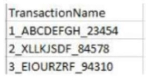 The users of a Qlik Sense app report slow performance. The app contains approximately 10 million rows of data. The business analyst notices the following KPI master measure definition: Left{ Trim( TransactionName), 1 ) * Right ( TransactionName, 5) Which steps should the business analyst complete to improve app performance?
-
A
Ask the developer of the underlying database to change the structure of the field TransactionName.
-
B
In the Data manager, use the Split function to split the field values with the underscore character as the separator.
In the Data manager, use the Add calculated field function to multiply the 1st and the 3rd column of the split field.
Reload the data.
-
C
Change the master measure definition as follows:
subfield( TransactionName, '',!)* subfieldl TransactionName, ' ', 3)
-
D
In the Data manager, use the Replace function to remove the middle part of the field TransactionName
Reveal answer details
Close answer details
Correct answerB
ExplanationThe app is experiencing performance issues due to inefficient calculations in a master measure that processes the field TransactionName, which has a complex structure (e.g., "1_ABCDEFGHI_23454").
Let's analyze the available options and why Option B is the best solution.
A. Ask the developer of the underlying database to change the structure of the field
TransactionName.While modifying the data structure in the underlying database might improve performance, this approach is not ideal. It's a time-consuming process that might not be feasible, especially when working with large datasets that have already been integrated into the Qlik Sense app.
The performance improvement should focus on optimizing the Qlik app itself.
B. In the Data manager, use the Split function to split the field values with the underscore character as the
separator. In the Data manager, use the Add calculated field function to multiply the 1st and the 3rd column of the split field. Reload the data.This is the most efficient approach. By using the Split function in the Data Manager to break down the TransactionName field based on the underscore separator, the data becomes more accessible for calculations. You can then create a calculated field that multiplies the first and third components of the split data (corresponding to the 1st part and the numeric identifier at the end).
This reduces the need for complex string manipulation functions (e.g., Left, Right, Trim) within the master measure, which can be resource-intensive when applied to large datasets.
C. Change the master measure definition as follows: subfield( TransactionName, '',!) * subfield
( TransactionName, '', 3)This option suggests using the subfield() function to split the string within the master measure itself. While this approach is valid, it doesn't provide as significant a performance improvement compared to pre-processing the data in the Data Manager . Calculating fields directly within the visualizations is more computationally expensive compared to handling it during the data load phase.
D. In the Data manager, use the Replace function to remove the middle part of the field
TransactionName.The Replace function would remove the middle section of the transaction name, but it doesn't address the need to split the field for efficient multiplication. It would also result in a loss of important data that may be required for other analyses. References:
The Data Manager provides powerful tools for transforming and optimizing data before it is used in visualizations. Pre-processing the data using functions like Split significantly reduces the load on front-end visualizations.
Splitting fields during the data load rather than in the master measures improves performance, especially
in large datasets where string manipulation functions in visualizations can degrade performance.
Calculated fieldsallow analysts to create new expressions based on transformed data, ensuring that the app remains efficient while meeting analytical needs.
Thus, the correct solution is touse the Split function to separate the field values and then use a calculated field to multiply the required components , which enhances app performance.
A business analyst is working with retail data for consumer products. The customer is interested in the following: 1. Ability to look for outliers on sales volume and margin %
2. Ability to understand the clustering of products visually
3. Ability to see products that are above the median sales volume Which action should the business analyst take to implement these requirements?
-
A
Create a pivot table and color the sales volume cell using K-Means function and median sales volume as an additional column
-
B
Create a treemap visualization showing sales volume and margin% by product with the median sales volume in the title
-
C
Create a combo chart with K-Means colors for the bar and a line measure representing median sales volume
-
D
Create a scatter plot using K-Means to color the products and add a median sales volume reference line
Reveal answer details
Close answer details
Correct answerD
ExplanationA scatter plot is the best choice for visualizing outliers, clustering, and products that are above the median sales volume. Scatter plots are excellent for showing relationships between two variables (like sales volume and margin %) while providing the ability to highlight outliers. By using K-Means clustering to color the products, the business analyst can visually group similar products. Additionally, adding amedian sales volume reference line makes it easy to identify which products are above or below the median. Key Concepts:
Scatter Plot: This visualization is ideal for detecting outliers and understanding the distribution and clustering of data points.
K-Means Clustering: This technique groups similar data points (products) based on their values, which helps to identify patterns visually.
Median Reference Line: Adding a reference line for median sales volume ensures that the analyst can easily see which products are performing above or below the median. Why the Other Options Are Less Suitable:
A. Pivot table: While a pivot table could show aggregated data, it is not as effective for visualizing outliers
or clustering as a scatter plot.
B. Treemap: A treemap can show hierarchical relationships but is not as effective for identifying clusters or
outliers.
C. Combo chart: A combo chart is not as well-suited for visualizing clustering and outliers as a scatter plot. References for Qlik Sense Business Analyst: Outliers and Clustering Visualization: Qlik Sense recommends scatter plots for visualizing relationships between two measures and for detecting outliers and clustering in the data.
Thus, creating a scatter plot with K-Means clustering and a median sales volume reference line is the best approach, making the verified answer. D
A marketing team needs to display sales for a limited number of products by providing a bar chart that the user can control. The visualization has several requirements: 1. Starts with the top five products
2. Allows the user to change the number of products displayed
3. Allows the user to scroll through all products on a mini chart The business analyst creates a bar chat and a variable. Which steps should the business analyst complete next?
-
A
1. Add the slider object and use the variable to set its value
2. Set the number of bars to custom and use the variable to set its value
-
B
1. Use the variable to fix the limitation
2. Add an input box to enable the user to enter the required value
-
C
1. Use the variable to fix the limitation
2. Add a slider object and use the variable to set its value
-
D
1. Add the slider object and use the variable to set its value
2. Use the properties to set the number of bars to custom
Reveal answer details
Close answer details
Correct answerA
ExplanationTo meet the requirement of controlling the number of products displayed in the bar chart, the business analyst should use a slider object tied to a variable. The variable will store the number of products the user wants to display. In the Appearance section of the bar chart's properties, the analyst can set the number of bars to a custom value using the variable, ensuring that the user can dynamically change the number of displayed products. Key Concepts:
Slider Object: This provides a user-friendly way for users to adjust the number of products displayed in the bar chart.
Custom Bar Limitation: By setting the number of bars displayed to a custom value controlled by the variable, the business analyst ensures that the user can dynamically adjust how many products are shown. Why the Other Options Are Less Suitable:
B. Use the variable to fix the limitation and add an input box: While this could work, sliders provide a better,
more intuitive user experience than input boxes for adjusting values dynamically.
C. Use the variable to fix the limitation and add a slider: This is almost correct, but it misses the step of
setting the number of bars to a custom value using the variable.
D. Add the slider object and set its value, but without custom bar settings: While adding a slider is correct,
not setting the number of bars to custom using the variable means the user wouldn't be able to dynamically control the number of displayed products. References for Qlik Sense Business Analyst: Dynamic Control with Variables and Sliders: Qlik Sense best practices recommend using sliders and variables to give users control over visualizations, particularly when it comes to dynamically limiting data displayed. Thus, adding the slider object and setting the number of bars to a custom value controlled by the variable is the best solution, making the verified answer. A
A clothing manufacturer has operations throughout Europe and needs to manage access to the data. There is data for the following countries under the field SACOUNTRY -> France, Spain, United Kingdom
and Germany. The application has been designed with Section Access to manage the data displayed. 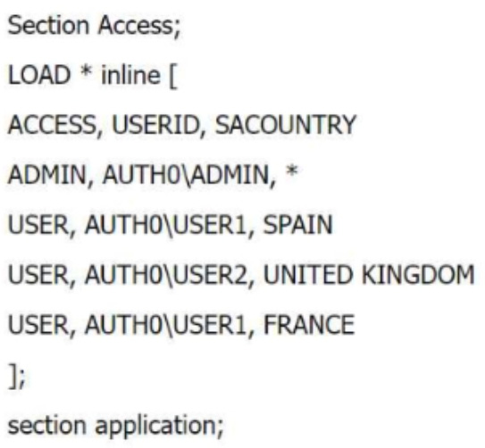 What is the expected outcome of this Section Access table?
-
A
USER1 sees data for France and Spain, USER2 sees data for the UK. ADMIN sees data for France, Spain, Germany and United Kingdom
-
B
USER1 does not see data for France and Spain. USER2 does not see data for the United Kingdom.
ADMIN sees data for all countries.
-
C
USER1 does not see data for France and Spain, USER2 does not see data for United Kingdom.
ADMIN can not open the application
-
D
USER1 sees data for France and Spain, USER2 sees data for the UK. ADMIN sees data for France, Spain and United Kingdom
Reveal answer details
Close answer details
Correct answerA
ExplanationIn this Section Access script, the roles and access to data for different users are defined based on the SACOUNTRY field. Here's how the data access will work: ADMIN: The ADMIN user has access to all data because the * in the SACOUNTRY field allows full access to all countries in the dataset.
USER1: This user has access to Spain and France because the SACOUNTRY field specifies these countries for USER1.
USER2: This user has access to United Kingdom because the SACOUNTRY field specifies only the UK for USER2. Key Concepts:
Section Access: This feature in Qlik Sense controls which data users can see based on their login credentials. The access rights are controlled through fields like ACCESS USERID , , and SACOUNTRY in this case. Why the Other Options Are Less Suitable: B and C: These suggest that users won't see data they have access to, which contradicts the defined Section Access script.
D: This incorrectly assumes that ADMIN cannot see Germany, which is not defined in the script. References for Qlik Sense Business Analyst: Section Access Best Practices: In Qlik Sense, Section Access tables define the data that users can see, and the use of * for the ADMIN role ensures access to all data.
Thus, is the correct answer because it matches the expected data access behavior based on the script, making A it the verified answer.
|