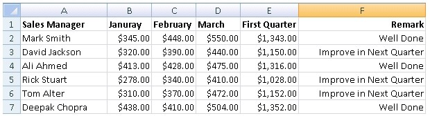
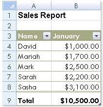
In order to accomplish the task, you will have to insert a pie chart in the worksheet. Excel provides a pie chart facility to display data that is arranged in one column or row on a worksheet. Pie charts display the size of items in one data series, proportional to the sum of the items.
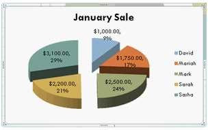
The items in the pie chart are displayed as a percentage of the whole pie. Answer: C is incorrect. Excel provides column chart facility to display data that is arranged in columns or rows on a worksheet. In column charts, categories are organized along the horizontal axis and values along the vertical axis.
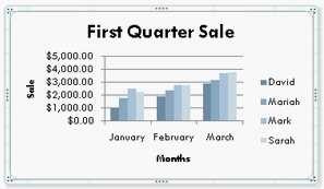
Column charts are used for showing data changes over a period of time or for illustrating comparisons among items.
Answer: A is incorrect. Excel provides a column chart facility to display data that is arranged in columns or rows on a worksheet. Line charts are used to display continuous data over time, set against a common scale. In a line chart, category data is distributed along the horizontal axis, and all value data is distributed along the vertical axis. Line charts are ideal for showing trends in data at equal intervals.
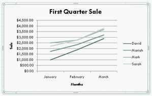
A line chart should be used where category labels are text, and are representing evenly spaced values such as months, quarters, or years.
Answer: D is incorrect. A bar chart is a feature provided in excel to graphically display data that is arranged in columns or rows on a worksheet. Bar charts are used for illustrating comparisons among individual items.
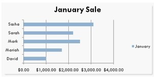
Bar charts are useful where axis labels are long.